64 Fabulous Examples Of Creative Advertising Done Right
As humans, we tend to have very short attention spans; this is what makes the job of advertisers difficult. To sell a product, the advertiser must first catch the attention of potential buyers and then keep it long enough to convince them that they either need or want the product in question. This list is a comprehensive collection of some of the best advertising campaigns we can find. These advertisements are eye-catching, professional, and full of creativity. From funny pictures from Chupa Chups, Tabasco, and even Ikea, you’re sure to find a creative idea that inspires you. Because after all, many great things start with that one main idea and then creativity comes into play. These ads caught our attention and they’ll certainly catch yours too.
Barilla: Happy New Year
This ad is a great example of how effective a minimalist approach can be. What makes it unique is the fact that the product being promoted was actually used to make the ad. It must have taken both time and patience to get the set-up just right and capture the winning photo.

This ad was created to promote Barilla pasta and the upcoming new year. The fireworks display showcased in the ad is made from pasta, which looks like it’s being thrown toward the camera. Add in the bright blue background for contrast, and you’ve got a masterpiece.
Chupa Chups: The Love Pop
In celebration of Valentine’s Day, Chupa Chups rolled out the red carpet for their Love Pops. These gorgeous red lollipops are double-sided, with a lollipop on each end and a short stick connecting the two. Really, these lollipops are pretty cute, aren’t they? They give off a cherry, feelgood vibe.
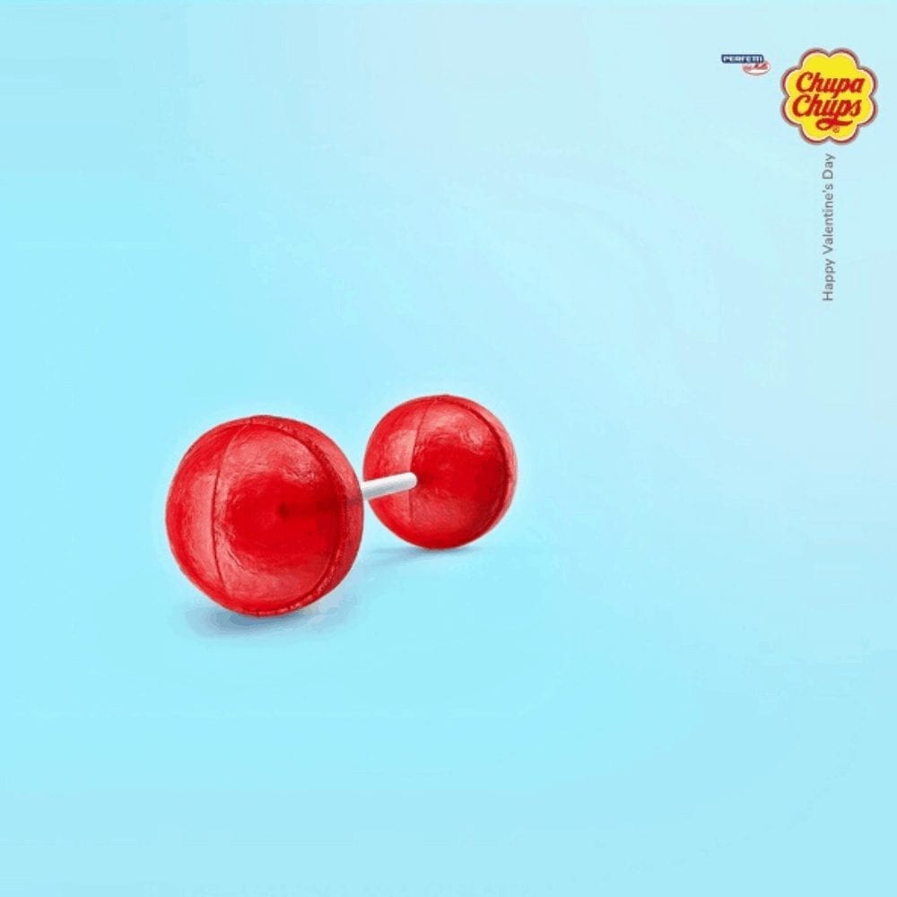
The company launched the product around the time of Valentine’s Day, playing off the old joke of the “meatball and spaghetti kiss” from Disney’s Lady and the Tramp. The idea was that couples could share a Love Pop and a kiss afterward — how sweet!
Tabasco Pepper Sauce: Volcano
In this ad, Tabasco advertises their sauce by comparing it to a volcano, which, for anyone who uses the stuff, will seem pretty accurate. Instead of depicting a volcano, though, this ad uses a human face and Tabasco sauce and fire to recreate it.
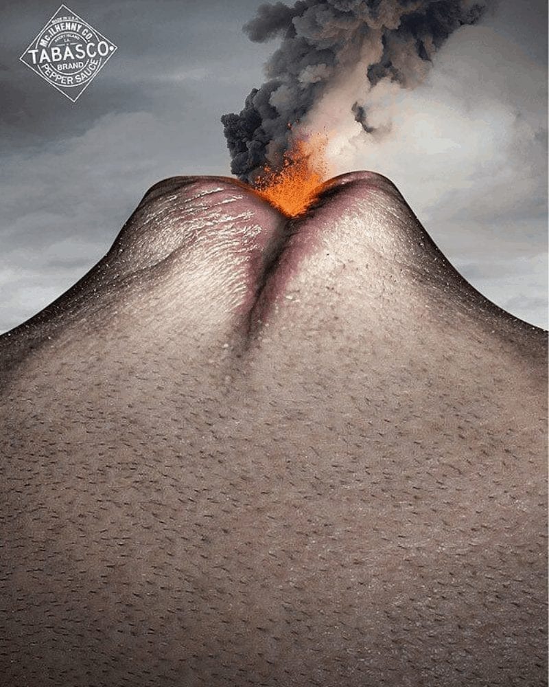
This is the facial expression of anyone who eats this spicy sauce. Between the symbolism and high-quality graphics, this is a really great ad for a really great sauce. As hotheads ourselves, we’re proud to say that we loved this sauce before this awesome ad even aired.
iPod Shuffle: iRun
Although iPod shuffles are largely invisible in today’s society, back in their day they were the must-have device among the general population. Back when they first came out, Apple also released a series of clever ads to promote the product.
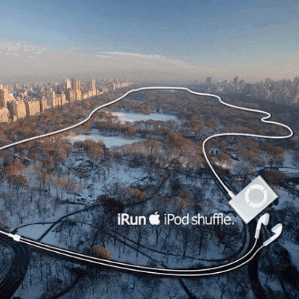
One of which is this one — the iconic “iRun” ad. This ad uses the product strategically, placing it against a photo of Central Park and using its earbud cords as a running track. It’s hard to say how the idea came about, but it’s safe to say that it’s a great one.
IKEA: Need Space?
Another fantastic ad, IKEA’s ‘Need Space’ was highly successful. The ad was made to promote a new shoe cabinet, using a unique tactic to entice buyers. It highlighted the problem that the cabinet would be solving instead of simply boasting about how great the product is.
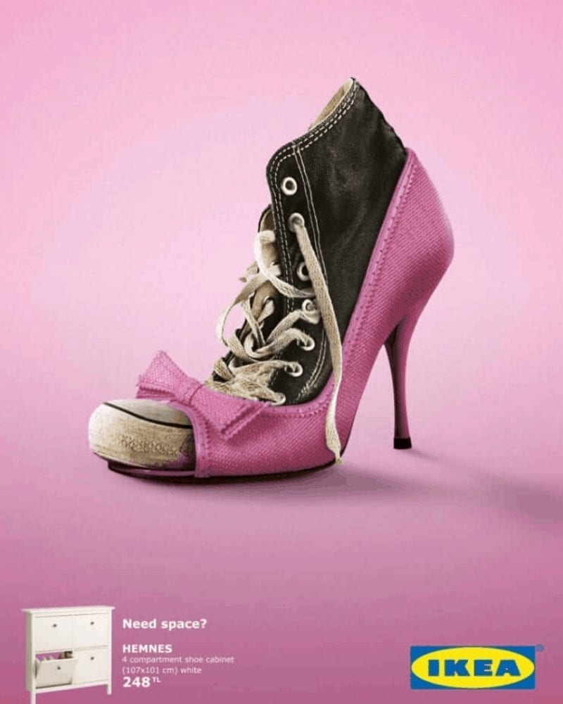
The ad shows two pairs of shoes fitted tightly together. The sneakers are squished into the high heels to save space, which is lacking — hence why buyers need the cabinet! The advertising in this advertisement is somehow subtle, but still super effective.
FedEx: Neighbors
FedEx’s thoughtful ‘Neighbors’ ad is one that we can’t not include on our list of advertising masterpieces. The ad, which is relatively simple compared to some of the others on this list, shows two buildings with world maps on them.
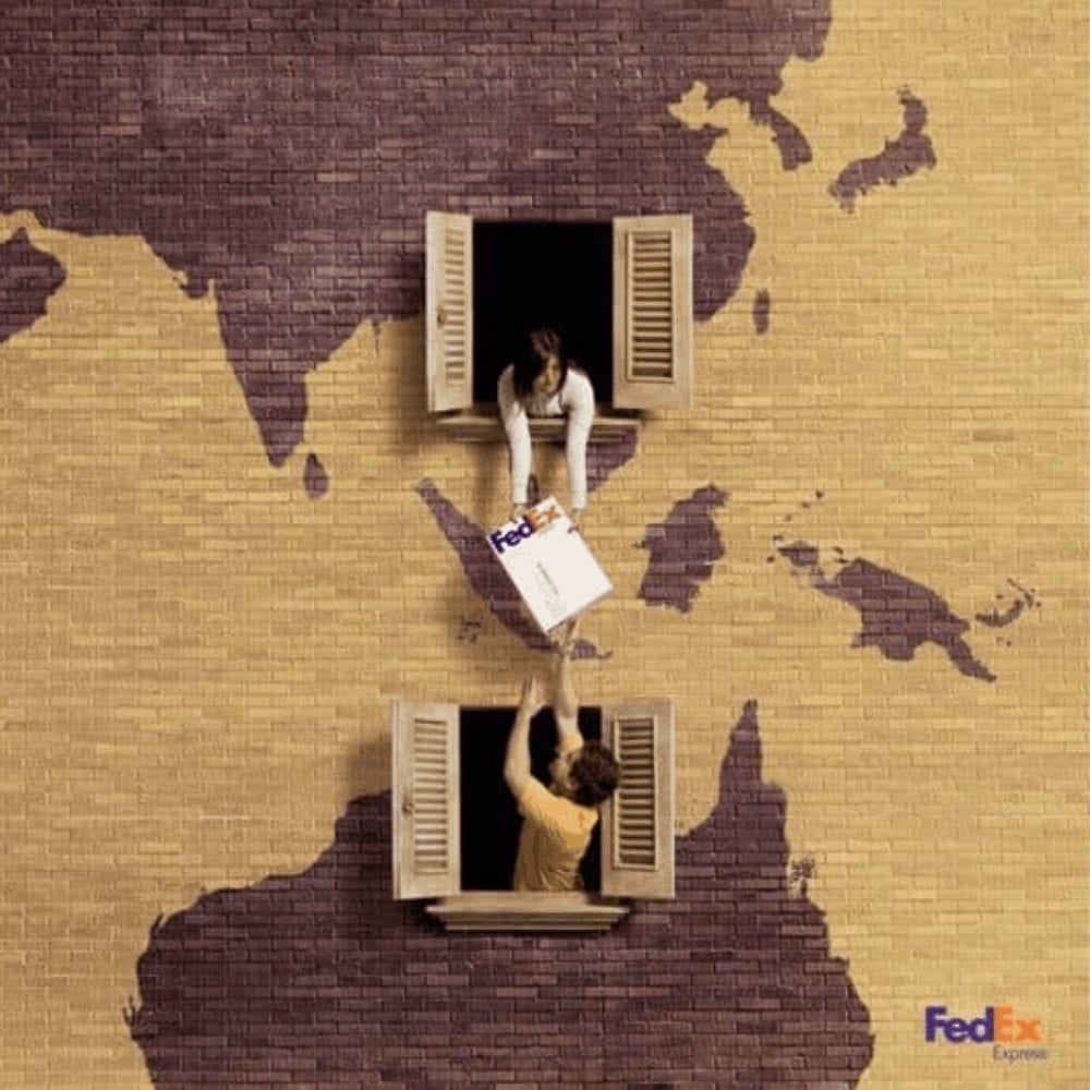
Each building has a window with an individual reaching out of the window as they pass a package back and forth. We can only assume that this represents how the delivery of goods from place to place using FedEx is as easy as passing items from neighbor to neighbor.
Pepsi: Scary Halloween
When it comes to brand competition, there’s nothing funnier than one brand poking harmless fun at its competitor. This is what Pepsi did to Coca Cola one Halloween. Don’t worry, though — no brands were harmed in the making of this ad!

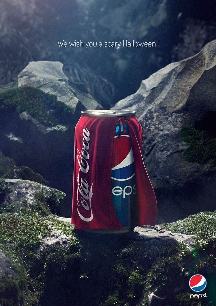
Pepsi put together this Halloween-themed ad where we see a can of Pepsi wearing a cape that reads ‘Coca Cola’ on it. To give the ad context, it says “We wish you a scary Halloween!”. While that tagline isn’t directly making fun of Coca Cola, the entire ad does imply that Pepsi acting like Coke would be scary.
Life Buoy: You Eat What You Touch
In an attempt to improve hygiene among the general population, Life Buoy developed the “You Eat What You Touch” campaign. Here, the image is of a loaf of bread that transformed into a pug after being touched with someone’s unwashed hands.
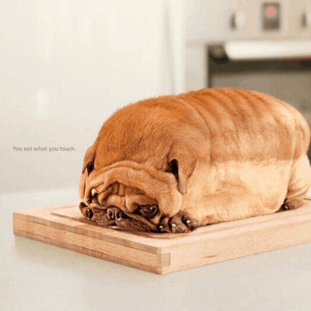
Essentially, the ad represents a dog owner who forgot to wash their hands after touching their pet. They then touched the loaf of bread and consumed the germs. That’s yucky! This ad is a great and gentle reminder to wash our hands.
San Francisco Department For Disability And Aging Services: End Ageism
Campaigning to end ageism, the San Francisco Department for Disability and Aging Services came up with the ‘End Ageism’ ad that you see here. The ad uses 5 young faces and replaces their eyes with those of someone much older.
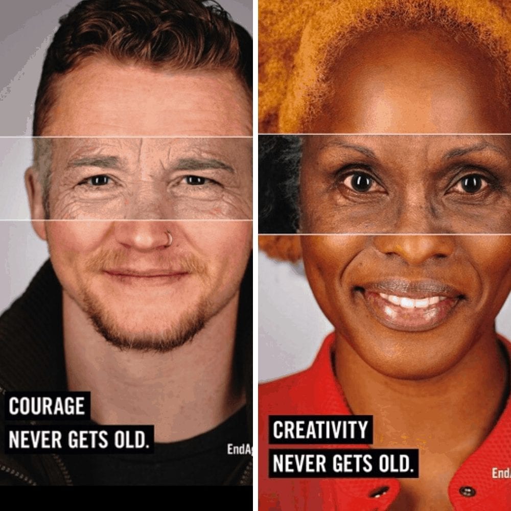
Each face was given an attribute: courage, creativity, intelligence, passion, and leadership, and each attribute was clearly written on the photos they were paired with. This ad is loved for its ability to provoke thought, which is likely exactly what the advertisers were going for.
WMF: Knives
WMF, a German tableware manufacturer, made the decision to use the pages of a popular magazine to advertise their knives. The sharpness of their line of knives is demonstrated using a fish, so if you’re squeamish, this ad might not be for you.
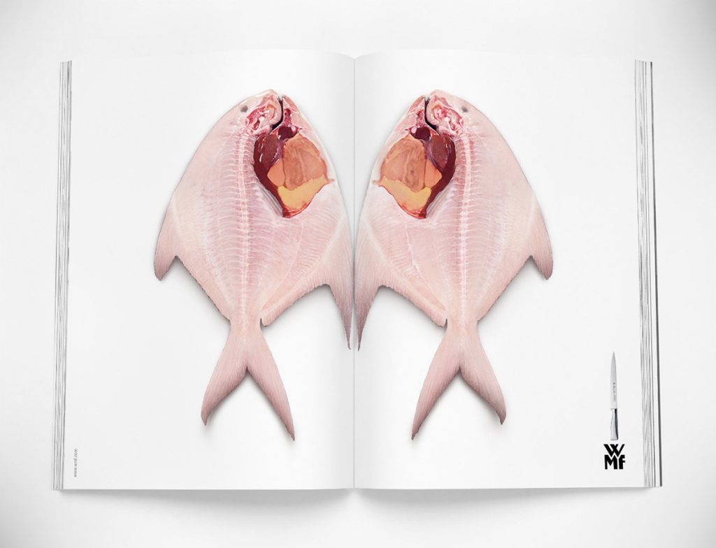
The fish is sliced into two equal parts, straight down the middle. The pieces are laid out side by side on two pages of the magazine, allowing the viewers to see the clean slice that the knife makes. “See? No jagged edges!” the ad seems to say.
Ricola: She’s Just A Friend
By far one of the most humorous ads on our list, this one is an ad for Ricola cough drops. The ad starts with a man coughing in between introducing a woman as his friend. We can only imagine how awkward that would be!
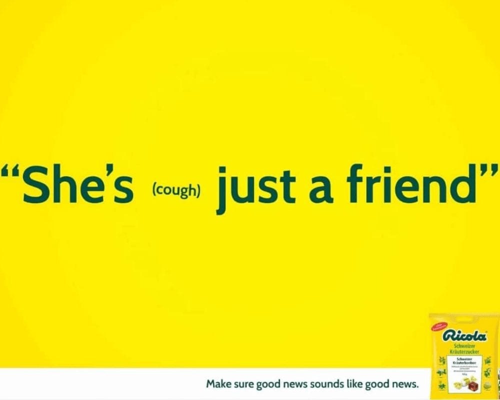
The situation goes from harmless to awkward pretty quickly because that badly timed cough gives off the vibe that this guy’s hiding something. In actuality, though, he just had a cough! What better way to avoid such problems than to have a Ricola?
Lazer Bike Helmets: Protect Your Head
Lazer Bike Helmets are one of the oldest and most trusted bike helmet brands on the market. Time and time again, their helmets have saved the heads of overly-excited children and clumsy adults. But, to remind everyone (in case they’ve forgotten!) just how effective their helmets are, they launched this ad.
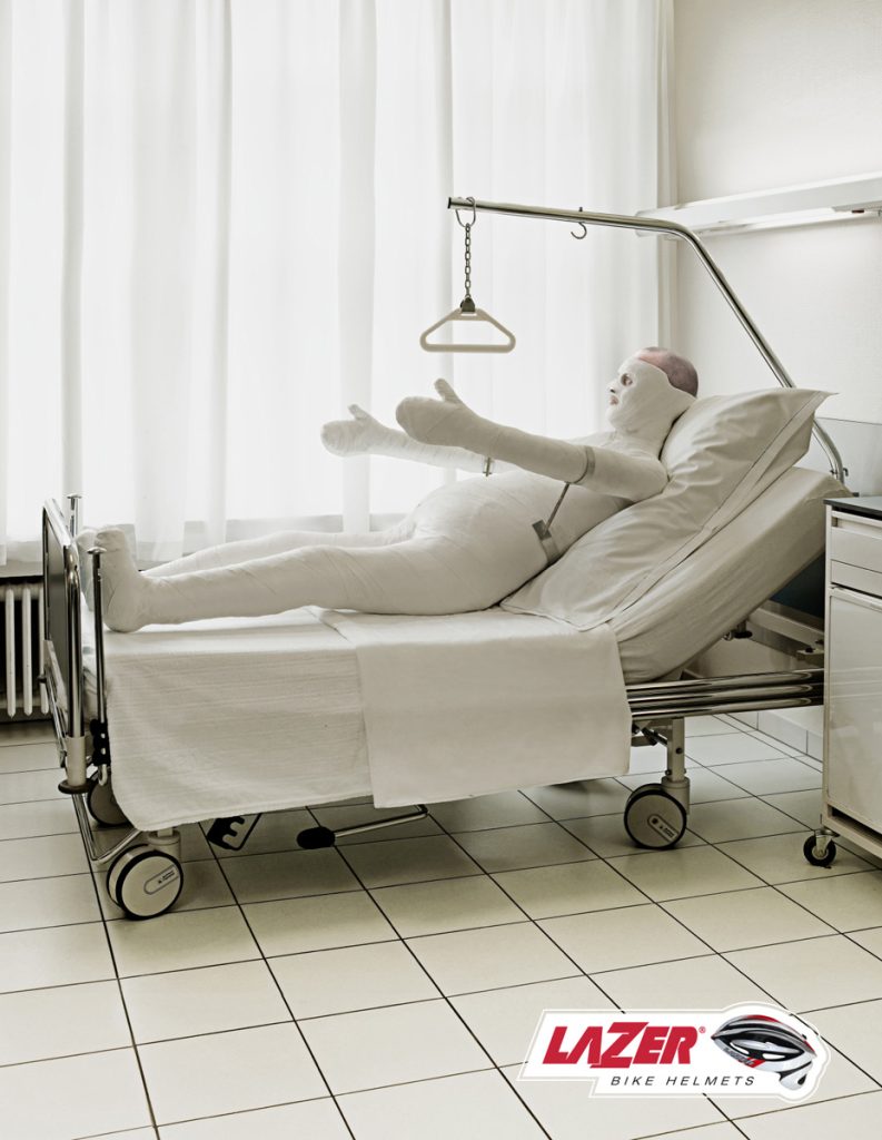
The idea of this ad is that if you’re wearing a helmet from Lazer, your head will always be safe — even when the rest of your body gets broken and bruised. Maybe next time he goes for a bike ride, the guy in this ad will buckle his helmet on a bit tighter.
McDonald’s: I’m Lovin’ It
If you’ve ever eaten at McDonald’s — which we’re almost 100% sure you have — you’ll likely have heard the term “I’m lovin’ it” in relation to the popular fast-food chain. Have you ever wondered where it came from? As it turns out, the term came from a very successful ad campaign that the chain launched.
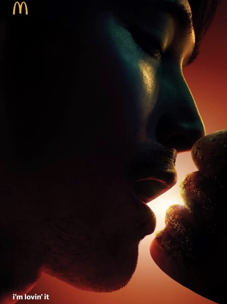
Known as the ‘I’m Lovin’ It’ campaign, the slogan came alongside a clever photo of a man about to dig his teeth into a juicy burger. The burger, though, is shaped like lips, as if he were going to kiss it.
Sedex: Trust Us, We Deliver It Fast
Our next ad masterpiece comes from Sedex, who is a supply chain company. The company prides itself on its ability to offer speedy deliveries, and in this ad below we see a woman preparing to cook herself eggs for her breakfast.
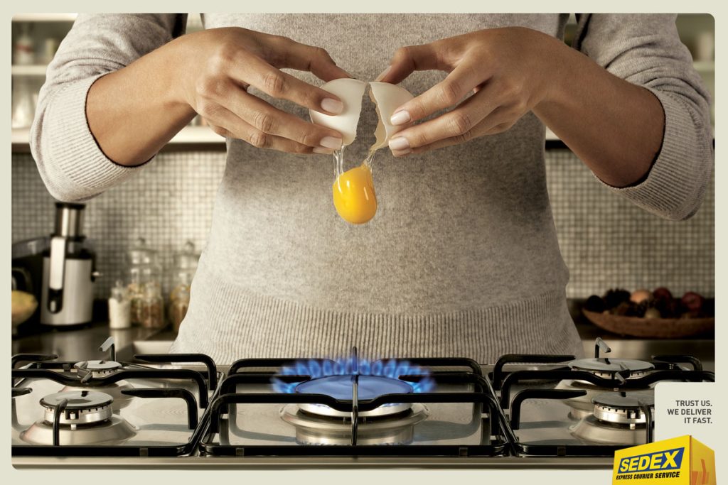
The woman is nearly ready to cook her egg: she has turned the gas stove on, cracked the egg, and started to pour it from its shell. The only problem is that she doesn’t have a pan. Here, Sedex suggests that it can deliver her the pan that she needs before the egg hits the gas.
McDonald’s: XL Coffee
Once again, McDonald’s makes it onto our list. This ad has a bit of different appeal, though. Looking at it, we bet you can guess what it is: its simplicity. Yes, this ad is really an ad; you just have to look closely and examine the entire thing.
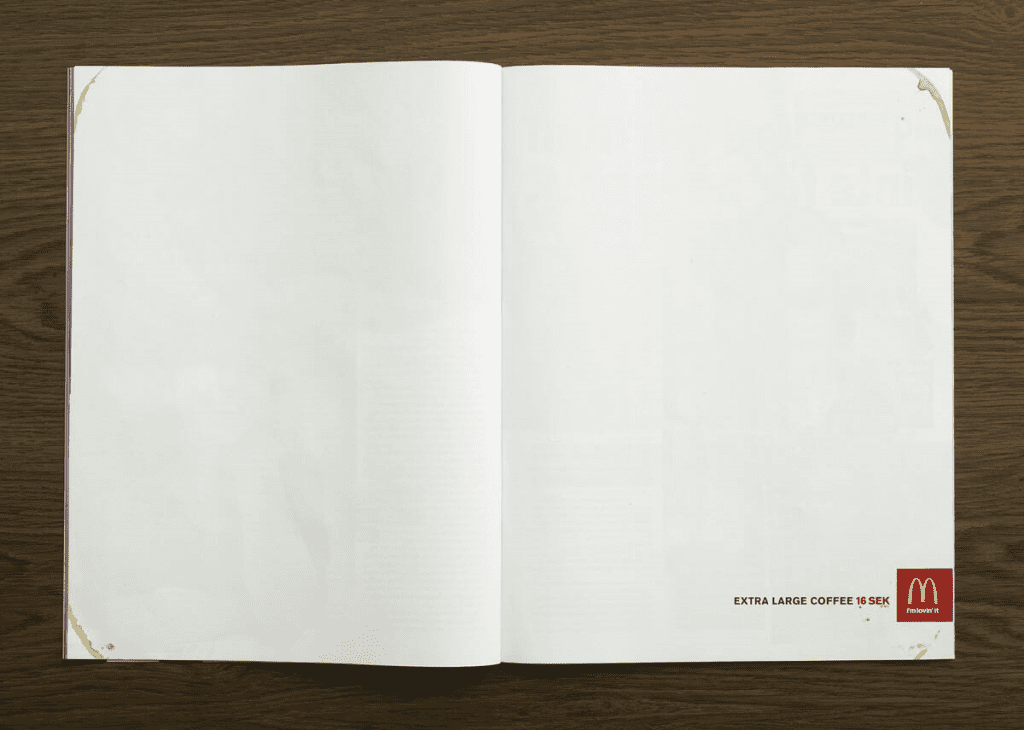
The ad is literally two blank pages (aside from the McD’s logo, of course). It also features a few carefully placed coffee stains but otherwise, there’s nothing to look at here. It’s said that this was done to depict how large the extra-large coffee really is.
Coca-Cola: Taste The Feeling
As if Coca-Cola wasn’t popular enough already, the brand managed to launch its most successful campaign when they released their ‘Taste The Feeling’ ads. Notice how we say “ads” instead of “ad”? That’s because the campaign included a number of catchy advertisements.
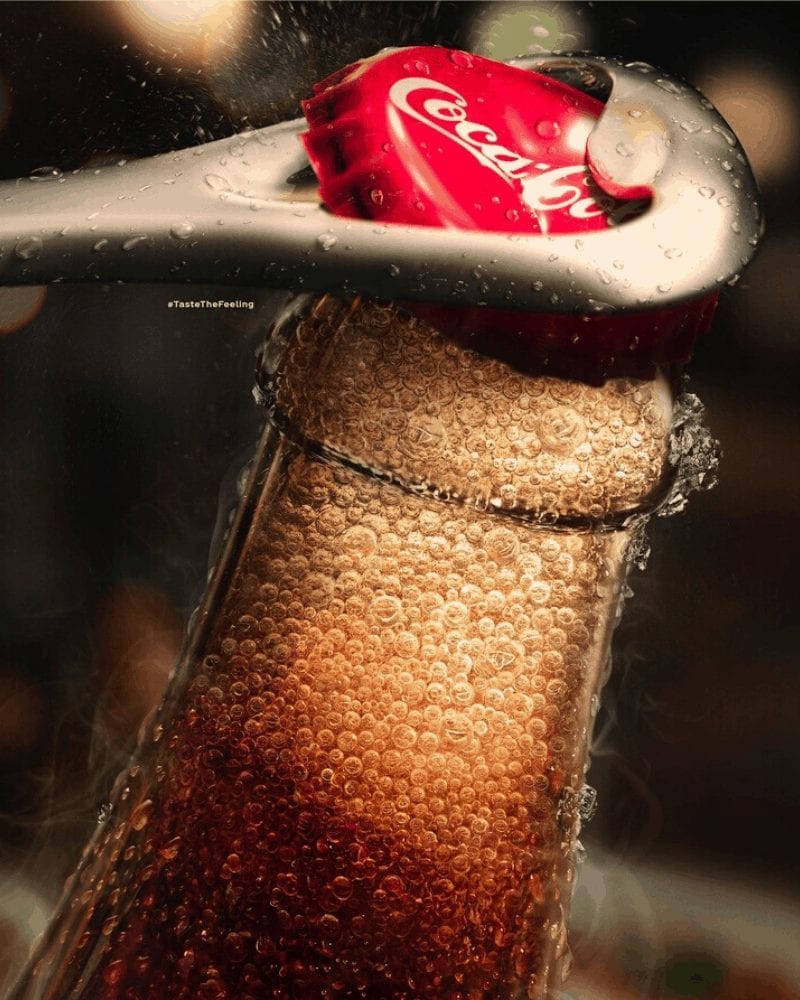
This one centered its focus on millennials. It portrayed various scenarios of love, friendship, and fun that, of course, all included bottles of Coca Cola. The idea is that a bottle of this ever-popular soda makes everything — including good times — better.
Apple: MacBook (2007)
Released in 2007, the Apple MacBook is one of the thinnest laptops that have made it onto the market. Apple came up with a magazine ad that compared the MacBook to the pages of the very magazine the ad was found in.
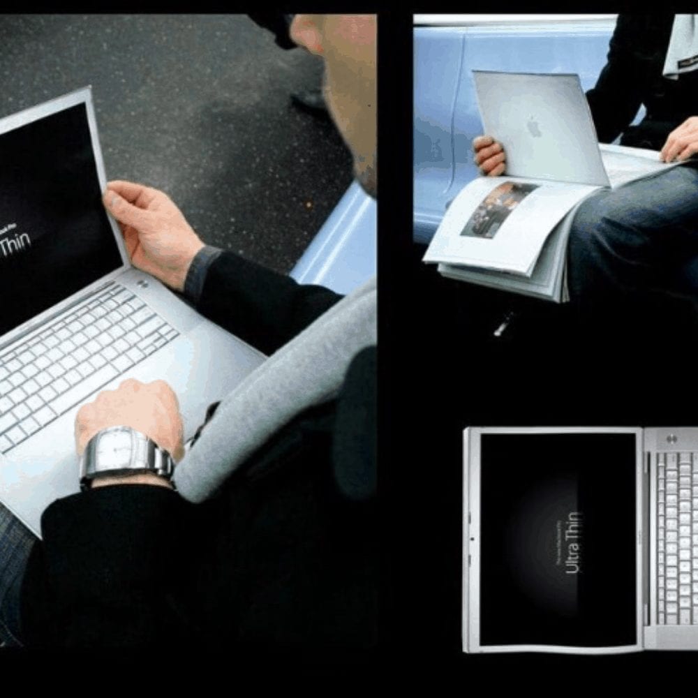
In the ad, a MacBook is shown. On its screen, it says “Ultra Thin”, which perfectly sums up the entire point of the ad. Although the device wasn’t quite as thin as the page it was being compared to, it was surprisingly close.
Continental: Weather Forecast
Another German company, Continental is best known for its tire manufacturing. Its tires can be found on vehicles all over North America and are thought to be extremely reliable. The brand launched a successful ad showcasing the diversity of their tires and watched their popularity skyrocket.

The ad that they can thank for this is their weather forecast ad. No, they didn’t claim to be weather experts. They did, however, use their tires as the rain for a rain cloud illustration. They also used them to depict sunshine, selling the idea that their tires are ideal for both rain and shine.
Chupa Chups: Ants
Chupa Chups has made their way into our lineup once again, this time with their ‘Ants’ ad. This ad was designed to promote the company’s sugar-free lollipops, which are supposed to be healthier and better for the teeth but just as tasty as the full-sugar version.
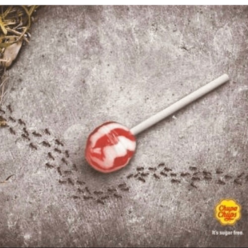
To showcase the authenticity of these lollipops, they made use of sugar-loving ants. They played on the fact that ants tend to flock towards sugary foods that fall on the ground. This photo shows the exact opposite occurring; instead of flocking to and swarming the candy, the ants are actively avoiding it.
Volkswagen: No Texting While Driving
This Volkswagen ad isn’t a product advertisement — it’s an important attempt to prevent drivers from texting while driving, which has become a serious problem in the face of a communication-driven society. The ad features pictures of a text message, where the writer has begun writing a text telling someone else their ETA.
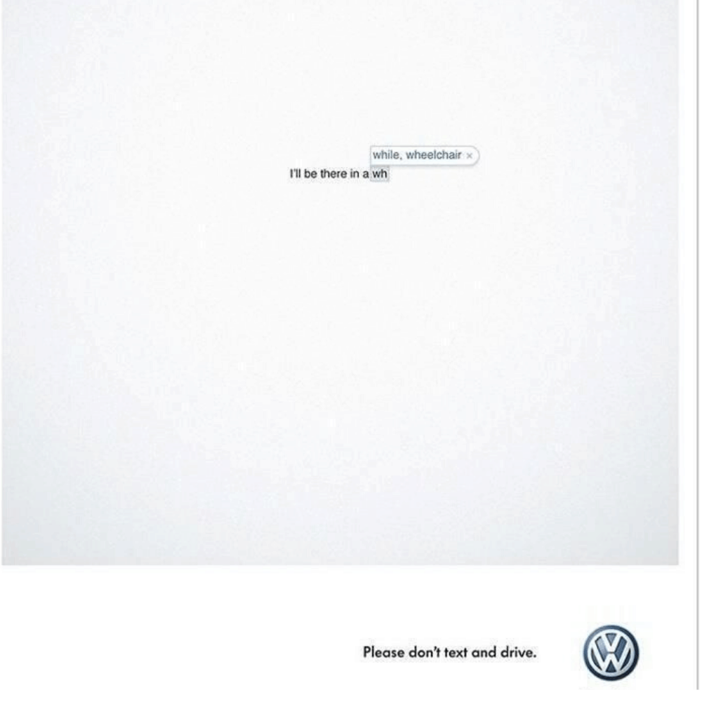
Unfortunately, the driver doesn’t seem to make it to their destination, which is depicted by the abrupt ending to the text message. It ends mid-sentence and with auto-fill popping up, suggesting that multiple buttons have been pushed, perhaps when the driver crashed their vehicle?
Heinz Hot Ketchup: Sizzling
If you have never heard of Heinz’s line of Hot Ketchup, you’re not alone — until we saw this ad, we hadn’t heard of it, either. Looking at the ad, though, it was clear that it was created by a marketing genius.
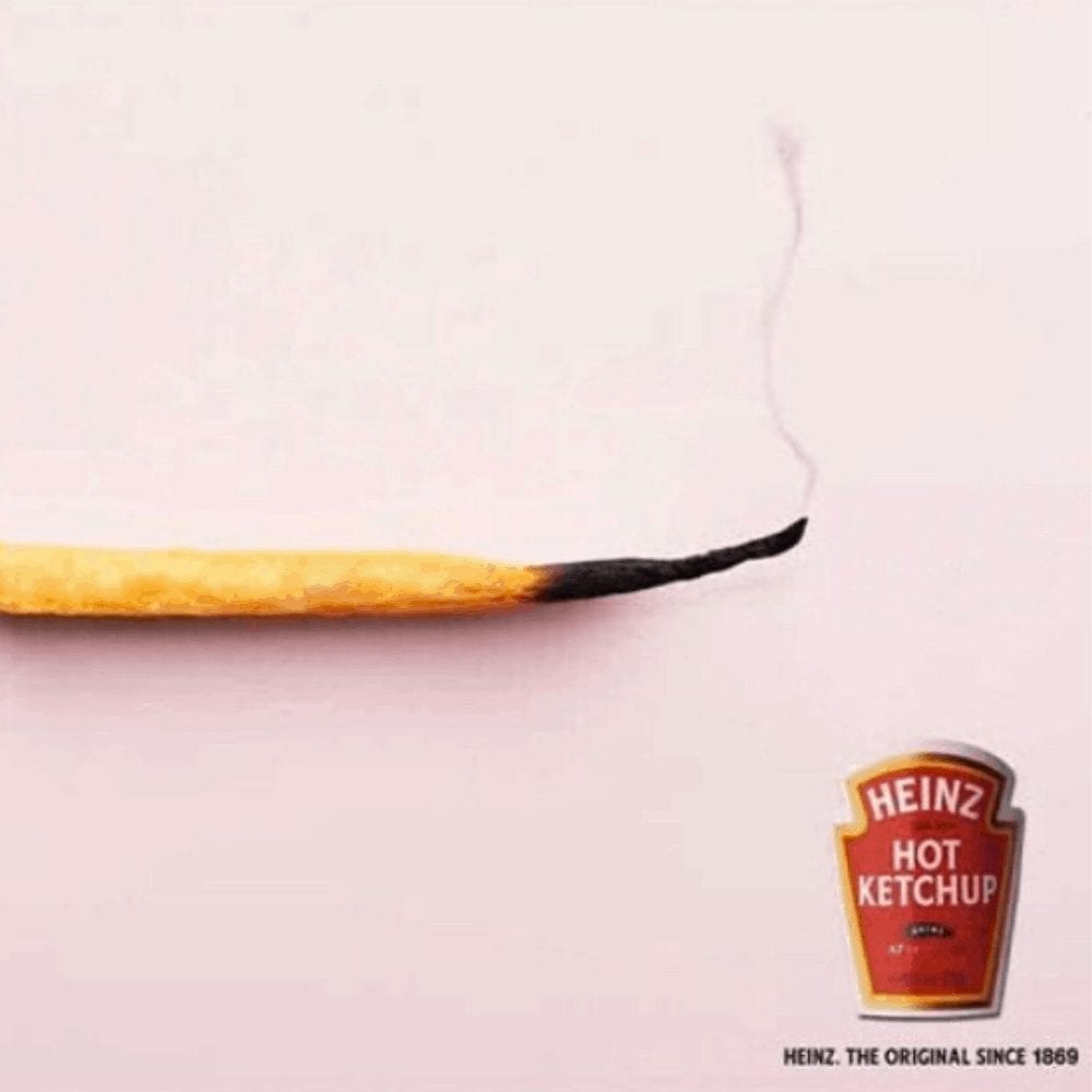
The ad shows a simple French fry, but the catch here is that the tip of the French fry is burnt and smoking. We can only assume that this is what happened when the fry was dipped into the hot ketchup. Yikes! We can only hope that the ketchup isn’t quite that hot.
Volkswagen: Touareg – The Luxury Off-Road
To introduce their new vehicle model, the Touareg, Volkswagen launched this masterpiece of an advertisement. The ad is titled “Touareg – The Luxury Off-Road” and showcases a mountain goat and a dog. These two wouldn’t normally be together in the wild, but for the purpose of this ad, their close proximity is fitting.
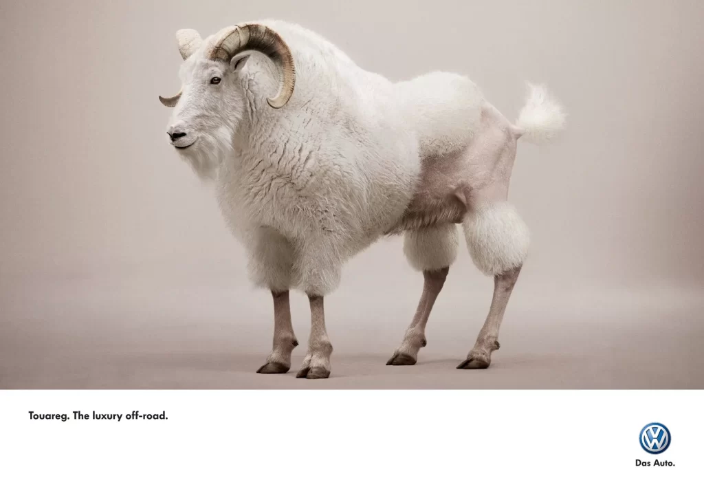
The mountain goat represents the off-road wilderness and the dog represents the city. Together, the two suggest that the Touareg is great for both city driving and off-roading. An added bonus for this ad is that the animals are both adorable!
WWF: Extinction Can’t Be Fixed
Released by World Wildlife Fund, this heartbreaking ad shows the irreversible effects of extinction. The ad, which can be hard to understand at first glance, features an aerial view of a car garage. Again, upon first glance, you might think the mechanic is being trampled — until you take a closer look.
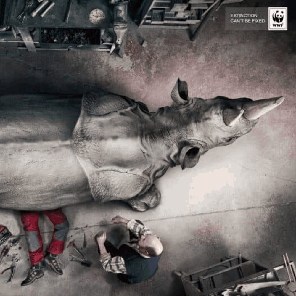
The mechanic in the photo is working on a vehicle- – except, it’s not a vehicle. It’s a rhino that has gone extinct and the mechanic seems to be working on it, trying to bring it back to life. Obviously, this doesn’t and won’t ever work, which is the whole point.
Faber Castell: True Colors
Faber Castell ran this creative ad for their colored pencils, which are known for their quality and popularity within the art community. The ad is simple, set against a white background, but easy for the eyes to process despite the ad’s overall lack of color palette.
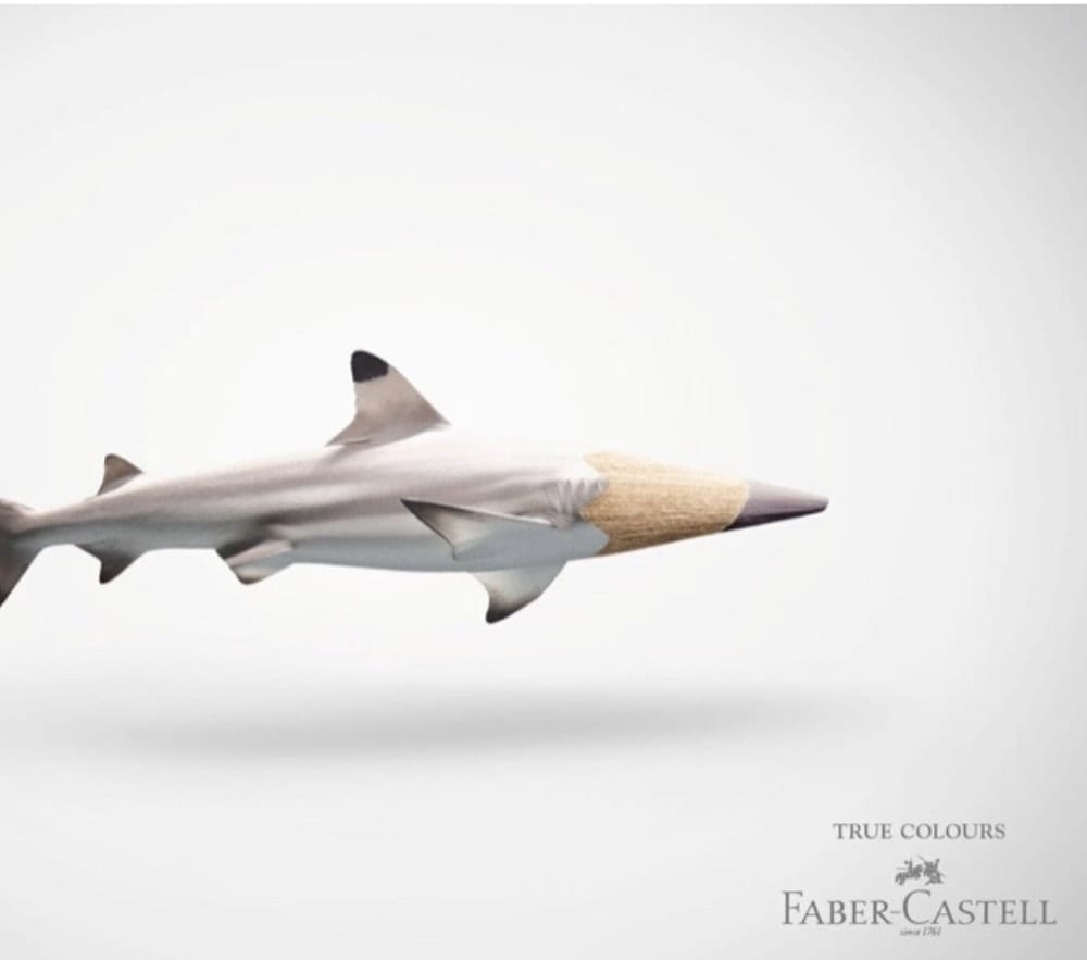
It shows the lower body of a gray-white fish, complete with a head that is made from the end of a colored pencil that is nearly the exact same color as the fish. Honestly, the simplicity of the ad is what draws us in, but the sheer genius behind the idea is what pushes it on our list.
ASICS: Los Angeles Marathon 2015
ASICS, a shoe manufacturer, was a sponsor of the 2015 Los Angeles Marathon (a fact you may have already known if you were one of the thousands who participated that blistering summer’s day!). The ad that was created to advertise the event showcases just how brilliantly creative the human mind can be.
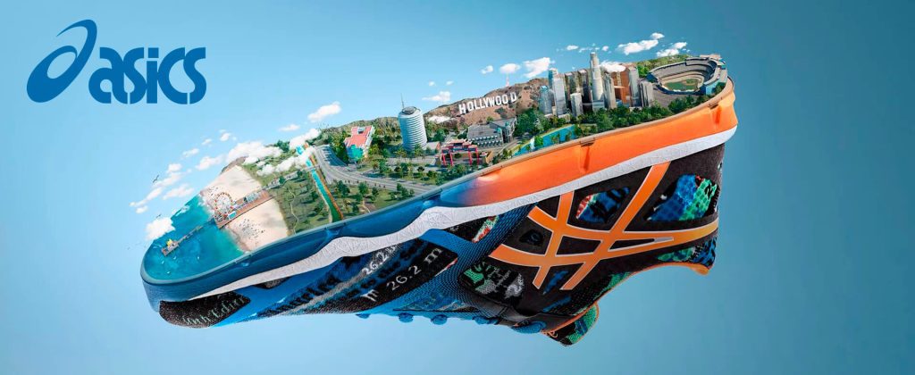
The ad we’re talking about effortlessly combines the shoe, which represents the marathon, and the city of Los Angeles. On the bottom of the shoe is the city, with many of its most popular landmarks features. A few of the landmarks include the Hollywood sign, Chinatown, and the Santa Monica Pier.
Nivea: Because Life Makes Wrinkles
This creative work of art is a Nivea ad that promotes their line of Men’s Active Age Moisturizers. The ad gently pokes fun at how parents are always saying that children give them wrinkles and a head of gray hair.
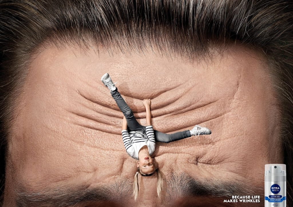
It shows an overly energetic little girl hanging off and tugging at a man’s forehead, thereby causing him wrinkles. This is likely a man and his daughter. The idea behind this slightly humorous ad is that by using this line of moisturizer, men can avoid the wrinkles caused by stress and worry.
Dettol: Sanitize Your Hands
Dettol is a hand sanitizer brand and, like every other brand of product on the market, they use clever ads to promote their products. This is one of those ads and we have to agree that is certainly is eye-catching.
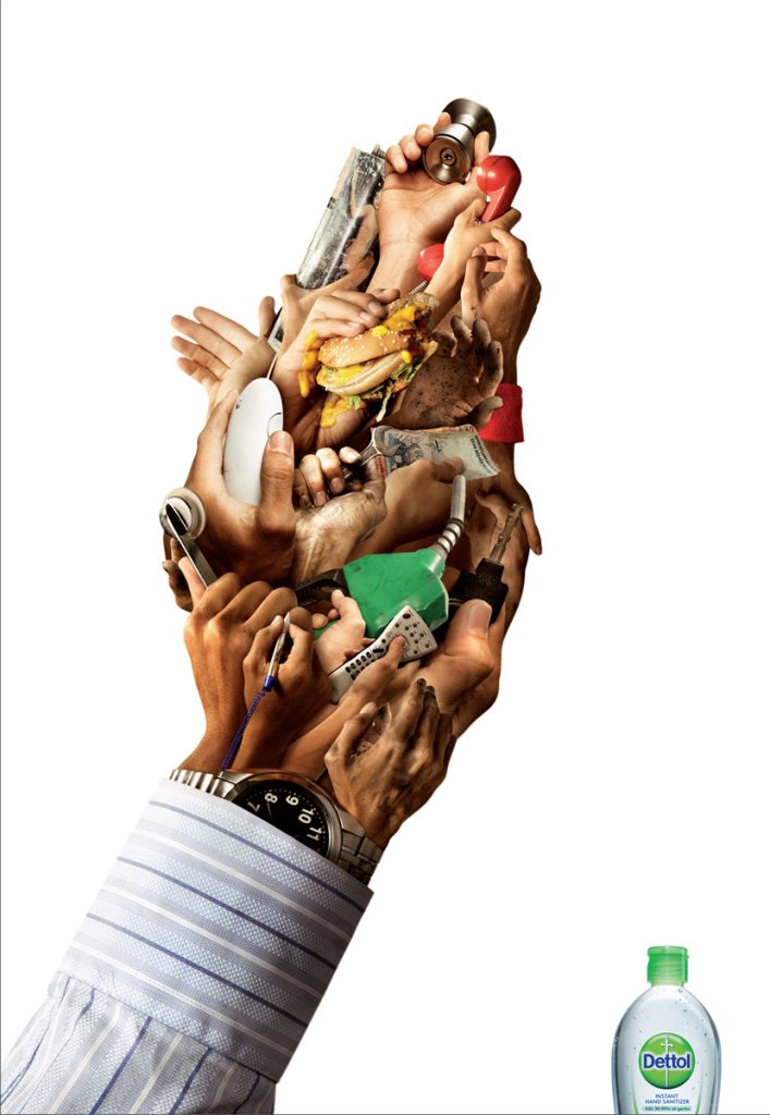
The ad, which appeared in various magazines, promotes the need to use Dettol hand sanitizer. Pictured are a man’s outstretched hands; in them is a large number of hands holding and touching various objects. Each set of hands represents an object he touched throughout the day, leaving us to assume that he failed to sanitize hands and has a plethora of germs on them.
Ford: The City Is In Your Hands
Ford is a brand that knows its target audience extremely well and how to offer them exactly what they need. Ford Fusion’s ad, ‘The City Is In Your Hands’, used a subtle play on words to entice their target audience.
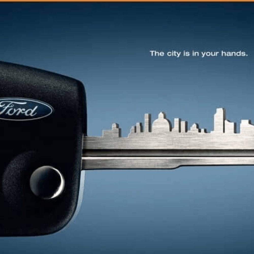
Since the ad is of a close-up of a Ford Fusion key, the advertisers used the key to create the skyline of a busy modern city. To us, this suggests that the vehicle is targeted at those who live in the city and is ideal for everyday city life. The vehicle is a Ford, though, so it’s probably safe to assume that it would also be good for driving on the highway.
Mint Vinetu Bookstore: Become Someone Else
In an ad put together by a Lithuanian bookstore, potential customers and book lovers are enticed to visit the store through the use of a simple, eye-catching ad. Using a real photo, a clean background, and some gorgeous typography, this ad looks like a million bucks.
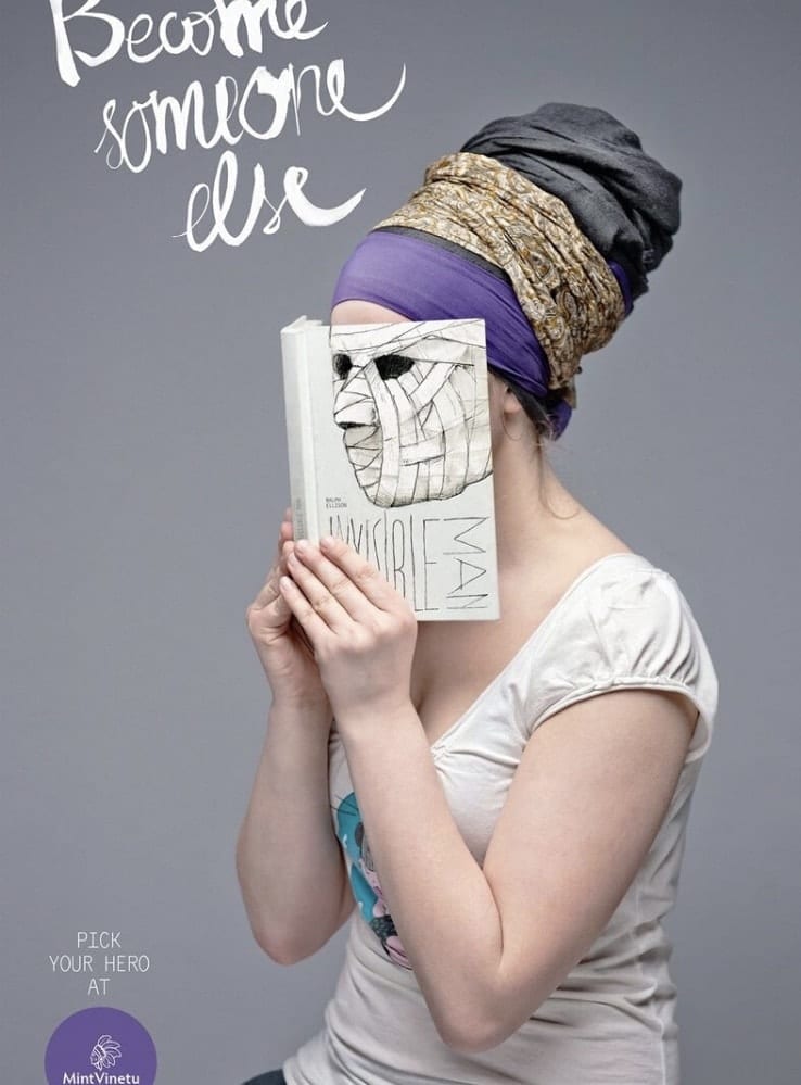
The ad features a woman reading, her face in the book. However, her face is blended with the book as she becomes the characters she’s reading about. If you read at all, you know how easy it is to “become the characters” when you’re invested in a good novel, and this is something that advertisers were banking on when they launched the campaign.
Zoo Safari: Blend In
In our opinion, this is one of the best ads on our list. It has flawless color combinations, great effects, and a general intrigue that captures our attention almost immediately. It also sort of reminds us of the lion Aslan from the Narnia series…
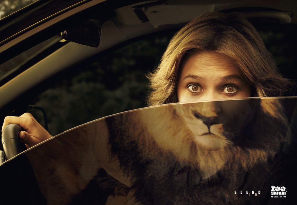
Encouraging guests to visit the zoo and have fun, the ad features a woman whose face is blending in with that of a lion. The lion is one of the animals at the zoo, while the woman is likely a visitor. The term “blend in” is very fitting for the ad, which adds to the ad’s appeal.
Ariel: Bright White
This ad is a stellar example of how exaggeration can make things interesting. Promoting Ariel’s Bright White detergent, its intent is to spread the idea that the detergent can get clothes so white that they flat out disappear on light surfaces.
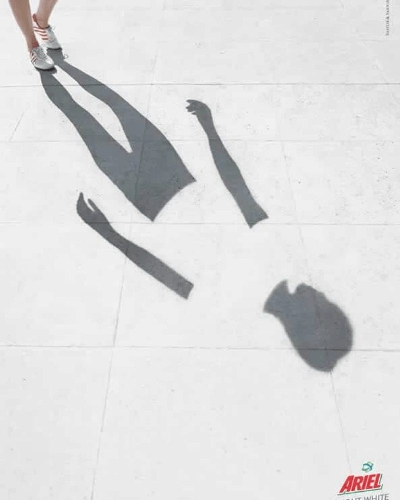
The ad shows the full-body shadow of a woman. Only her hands, legs, and head are visible in the shadow, though, with her torso blocked out with the same color of cement as she’s walking on. The shirt is so bright that it blocks this woman’s reflection. Amazing!
BMW: BMW M3
Offering a reference to a DC comic character, this ad was a hit among comic lovers and self-proclaimed nerds everywhere. The BMW M3 was geared towards speed demons, boasting the caption “A vehicle for real speed experts”. Who’s speedier than a speeding train and perfect for this ad?
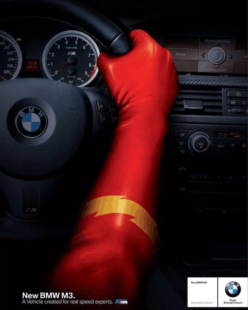
The Flash! Here, his arms are depicted clutching the wheel of the BMW M3. This DC hero fits right in, and he seems to be having the time of his life driving, too! Let’s just hope that he’s a good driver; we wouldn’t want The Flash to crash!
Weight Watchers: WW
This WW International ad takes the traditional “before and after” photo comparison and spins them on their head. While most ads of this sort use photos of real people, this one uses doors of different sizes instead, giving the ad a creative spin that we can appreciate.
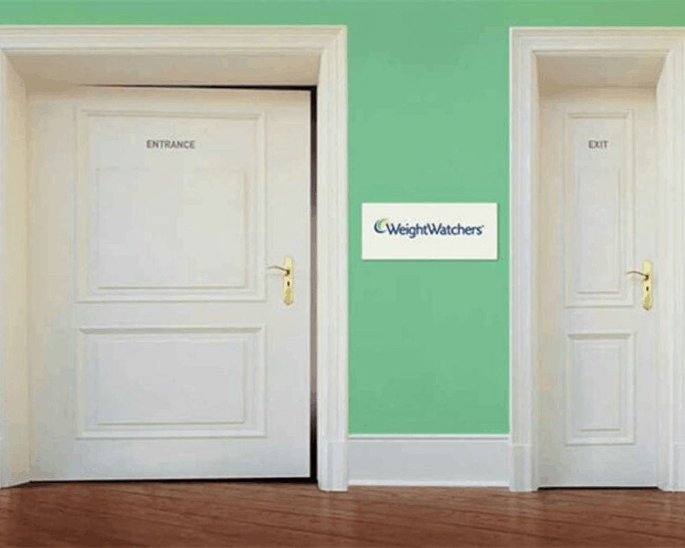
The larger door is marked as the entrance, while the narrower door is marked as the exit. This implies that the program will help customers lose excess weight and have them walking through the exit door a much happier, more fit person.
McDonald’s: Love Free Wi-fi
The McDonald’s French fry is arguably one of the best modern food inventions of our time. French fry sales alone could keep McDonald’s open, as customers consume them with almost any meal and they are bought even on their own as a snack.
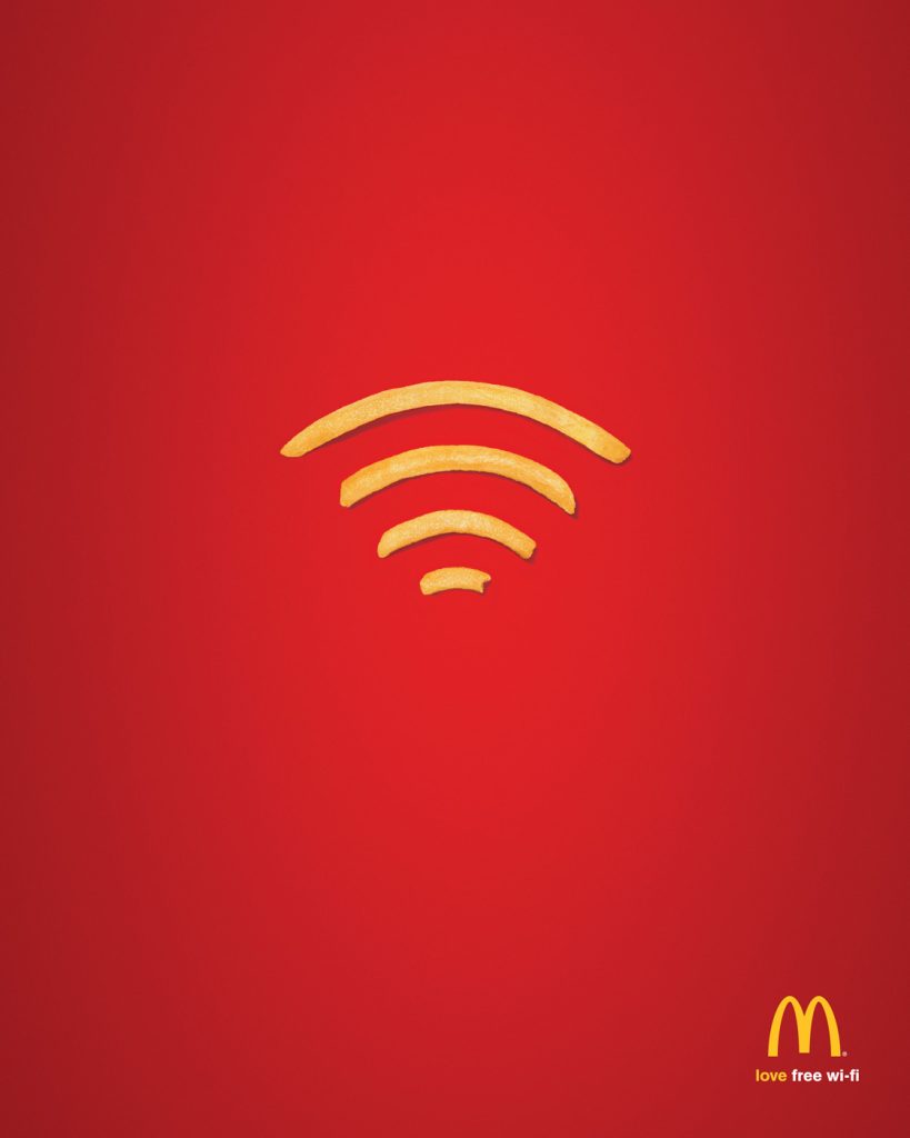

McDonald’s, alongside their mouthwatering, oddly addictive French fries, is also known for offering its guests unlimited wi-fi. To advertise this for anyone who wasn’t aware, McDonald’s put out this ad, using French fries to recreate the universal symbol for wireless internet.
Ford: Pre-Collision Assist
Known as the “Camouflage” campaign, this ad was released by Ford to promote their updated pre-collision assist feature. The feature, which uses modern camera technology, is geared towards preventing accidents by detecting pedestrians that appear in front of the vehicle.
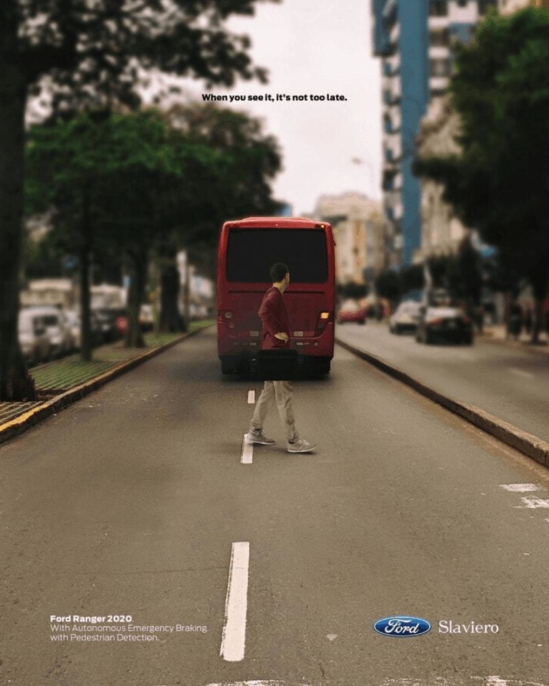
In the ad, the feature is represented by a Ford bus and a pedestrian standing in the middle of the road. To get its point across, the caption of the ad reads “When you see it, it’s not too late”.
WWF: Small Present For A Big Cause
The World Wildlife Fund for Nature is a well-known organization that focuses on the protection of our planet’s wildlife. When it comes to promoting its cause, it’s known for putting out heart-wrenching ads that stop viewers dead in their tracks and provoke thought.
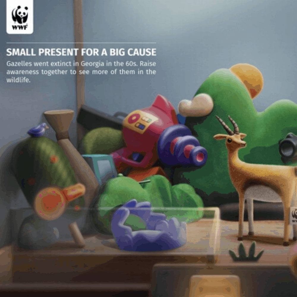
One of the many ads hosted by WWF, this one is dedicated to the raising of awareness for gazelles, who are extinct in the wild in the Caucasian republic of Georgia. The ad informs viewers that gazelles have been extinct since the 1960s and shows one lone gazelle standing amid several hunters and dangerous objects.
Colgate: Flossing
Let’s face it, fruit is delicious. Although, it can easily be as annoying as it is tasty thanks to all those seeds and little bits that get stuck in your teeth. As an oral care brand, Colgate is well aware of the problem and has taken steps to protect the teeth when seeds invade.
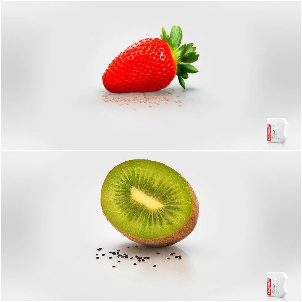
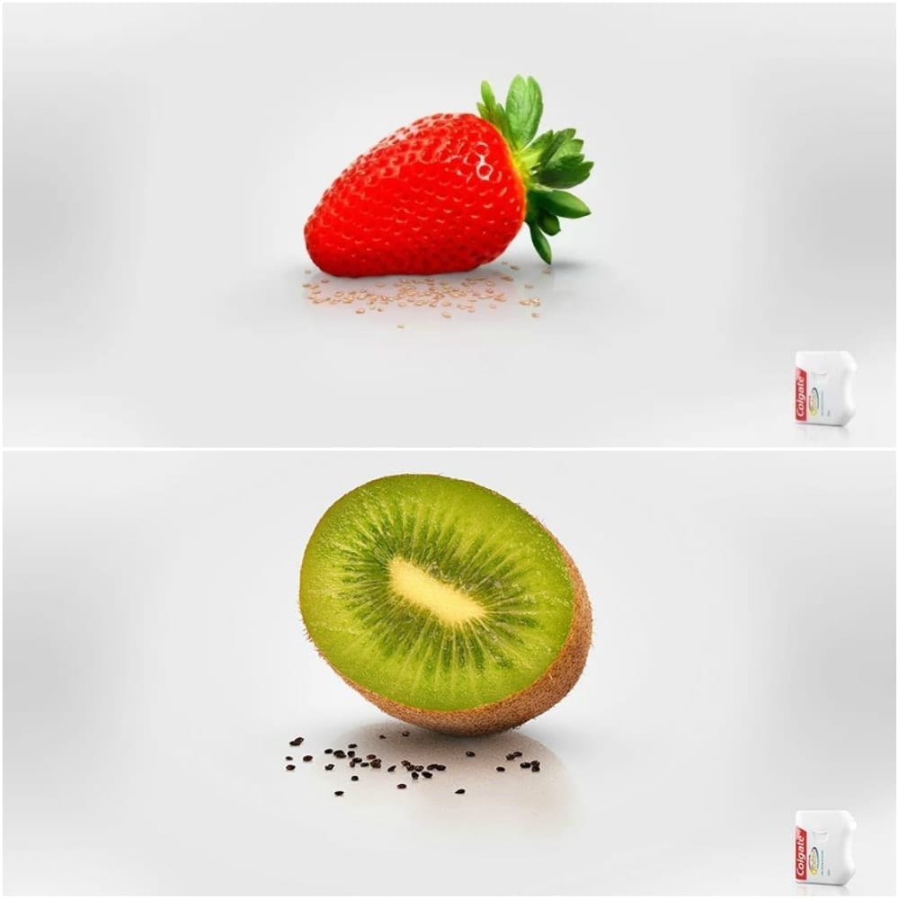
It uses ads like this one to advertise that its products are high-quality and equipped to handle issues like seeds, strings, and stubborn pieces of food that manage to wedge into your teeth and gums. This particular ad uses strawberries and kiwis as examples, showing how many seeds they have.
Sofia International Literary Festival: Revolution on 5 Continents
The 2019 Sofia International Literary Festival had prominent themes of violence, racism, and corruption. The overarching theme of the festival was Revolution on 5 Continents, and for this ad, they focused on the revolution in France. The ad itself is powerful and inviting.
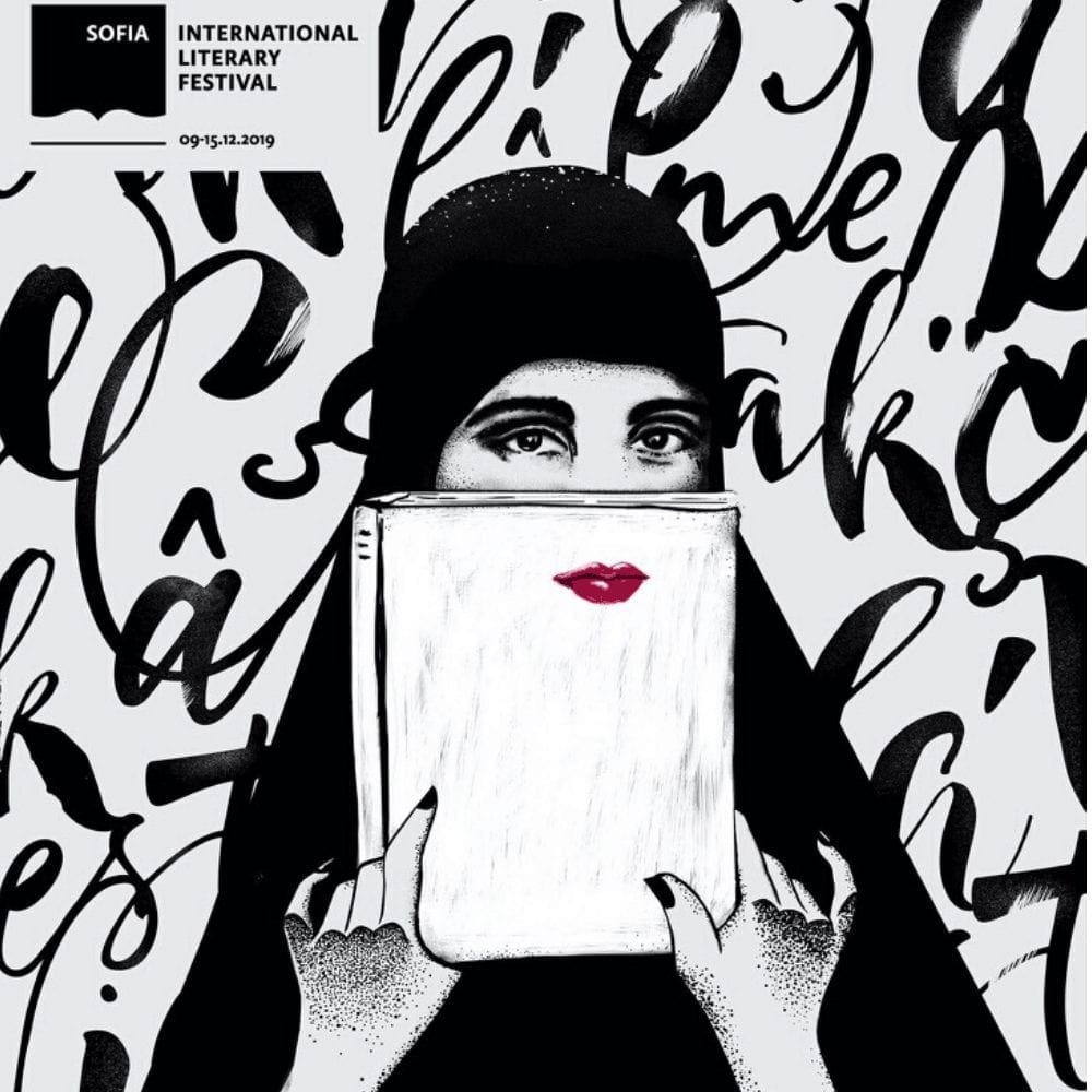
It showcases the artist’s skills through the use of both semi-realistic and completely abstract details. The red lips of the woman in the picture are what initially caught our eye, but the details are what held it long enough to take in the information the ad is giving out.
WWF: Horrifying And More Horrifying
The world’s ecosystem is a delicate being. In order to continue hosting life, it needs to be treated with care and kindness. Unfortunately, the human race hasn’t been doing a very good job of showing this care; sea creatures like sharks are in danger, with many extinct.
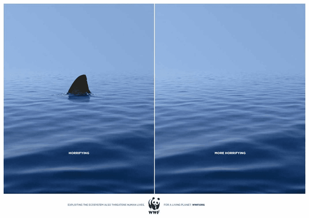
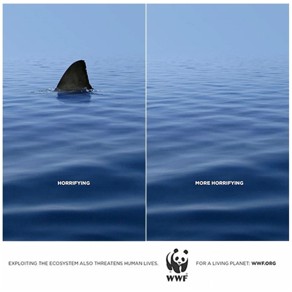
That’s what this WWF ad is trying to demonstrate. It shows sharks, which can be dangerous to humans, as well as a stretch of the ocean without sharks — which can be dangerous also. The ad does a good job of giving us a bit of food for thought.
Pedigree: Adopt
Pedigree is, by any standards, one of the most beloved dog food brands on the market today. Like many other companies, Pedigree advertises its dog foods through the use of creative ads — but that’s not the only thing it advertises.

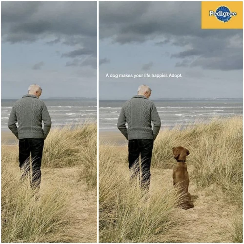
By looking at this touching ad, we see what else Pedigree stands for: adoption. The ad is a split-screen of a man standing alone and the same man standing in the same place, but this time with a four-legged friend that he adopted. The top of the ad reads “A dog makes your life happier. Adopt”.
Ecovia: Stop The Violencee
Created by the Mexican bus company, Ecovia, this ad is another of the many fantastic ads that have been produced in an attempt to curb texting and driving. Texting and driving have become a serious global problem, so we’re happy to see so many countries taking action against it.

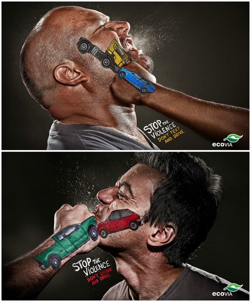
Instead of using real people to recreate the scene of a car crash, this ad uses a much more metaphorical approach. It plants the idea that texting and driving is the equivalent of domestic violence. In addition, it drives home the fact that we always have a choice; we can choose not to text and drive so that we can return home safely. The lower half of the ad targets drinking and driving, too.
Schick: Free Your Skin
By many, this ad (Shick’s “Free Your Skin” ad) has been deemed brilliant. The ad targets men, marketing their line of razors and trying to entice men to shave in a way that is humorous to the general public. The ad means no offense to men with beards and is something to be laughed at and marveled over.
It does this by replacing the beards of several men with large, furry animals. The animals used are known for carrying a lot of dirt and germs, so when they’re placed on the men’s’ faces, the meaning is pretty clear: beards carry germs. Yuck! Time to pick up a Schick.
Orion: Telescopes
Did you know that telescope companies make ads for their products? We didn’t! The idea had never occurred to us until, of course, we found this ad floating around on the web. Created by Orion, it promotes their most popular products — telescopes.
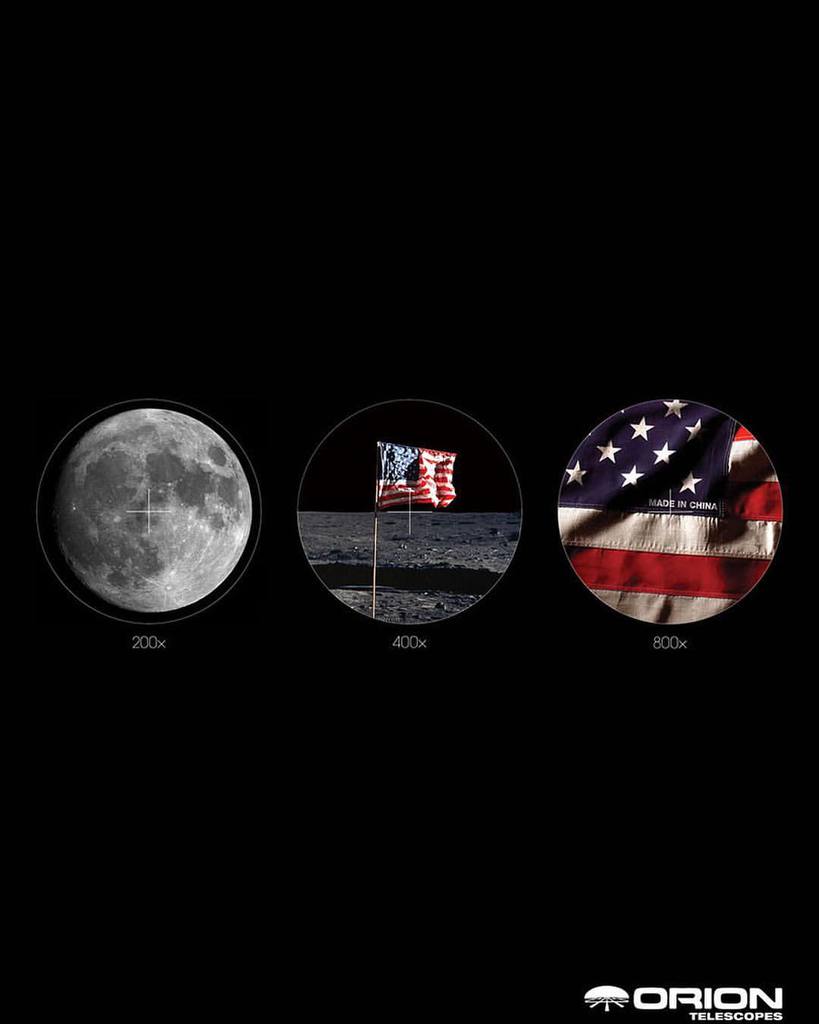

The telescopes in question here are able to capture closeups of the moon in such detail that viewers can see the American flags that have previously been placed there. Honestly, we find it a bit hard to believe that a telescope could zoom in that far, but it’s not illegal to exaggerate in ads so we’ll let it slide this time. Plus, the ad is pretty neat regardless of how true it is.
Australia Post: Letters
In a world that has been taken over by social media and texting, mailing letters to friends and loved ones has become a rare event. Australia Post, who feels strongly that letting mail should be more popular, created this work of art to advertise the act.
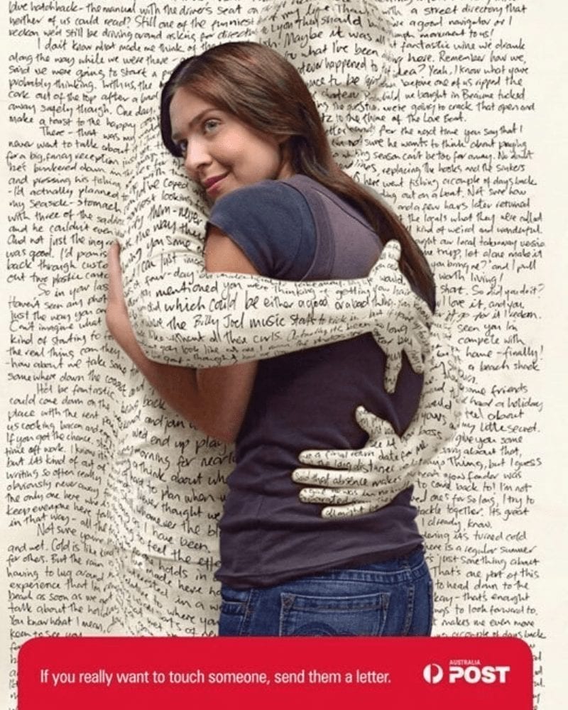
The meaning behind the ad is that sending letters is more personal and heartfelt than most of today’s modern forms of communication. To show this idea, the ad features a letter hugging a woman and the quote “If you really want to touch someone, send them a letter”.
Heinz: No One Grows Ketchup
Heinz has a way of putting together amazing ads. Whether they have a rockstar design team or a top-notch marketing manager, their ads are always welcomed with open arms. They do well in both print and on websites like Facebook and YouTube.
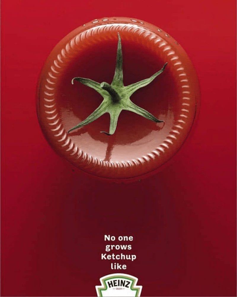
This one, the “No one grows ketchup likes Heinz” ad, is no exception. Staying true to fashion, the ad communicates the high level of care that goes into each bottle of Heinz ketchup. This care is shown via a tomato flower growing on the bottom of a glass ketchup bottle, which is both delicate and iconic to the brand.
Crusoe’s Men’s Underwear: Wake Up To The Adventure Inside
In this detailed ad, Crusoe’s Men’s Underwear carefully combines a catchy slogan with unique visuals and pleasing colors. It featured several men asleep in their beds and surrounded with sketches that represent the activities that they were doing in their dreams.
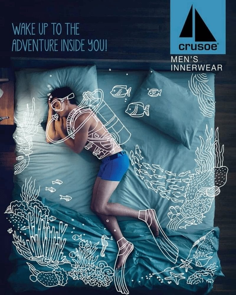
The meaning behind the ad is that when wearing Crusoe’s underwear, men can be as comfortable as possible while they sleep. The underwear are cozy and not too tight but tight enough that the wearer feels secure all night long. This allows them to live out their dreams in peace and comfort!
MTV Europe: Illegal Downloads
MTV Europe’s campaign to stop illegal downloads was nothing short of brilliant, hence why it’s on our list. Featuring the download bar that comes up when you download something online, the ad depicts the way musicians are harmed through the illegal downloading of their music.
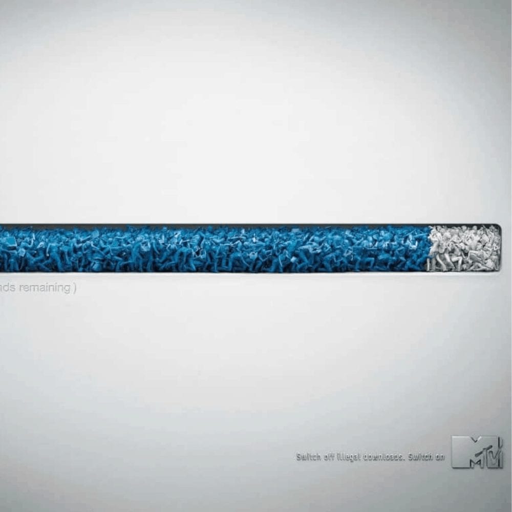
The download bar is full of little human figures that writhe and squirm in pain as the download nears completion. Not only is the idea behind the ad genius, but the blue and silver colors used in the download bar are, too, as they’re both incredibly appealing to the eye.
Volkswagen: Precision Parking
When this ad was launched by Volkswagen, it warranted a ton of positive reactions from the brand’s loyal fans. Part of the hype was due to the adorable animals pictured, but most was the result of the sheer anticipation of the new feature being promoted.
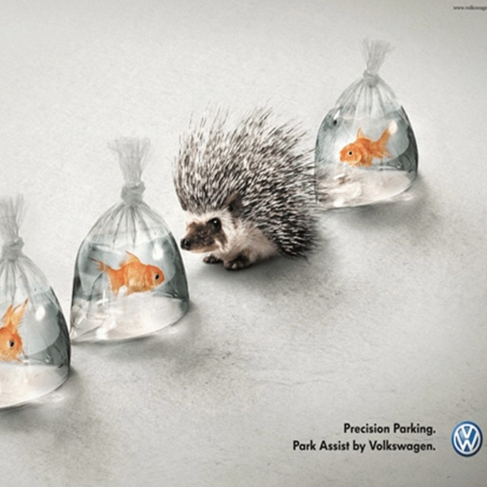
To demonstrate the precision parking feature, the ad uses bags of goldfish and porcupines. They are all lined up as if they were cars parallel parked along a busy street, with the porcupine quills not touching any of the bags.
Band-Aid: Flexible Bandages
This crafty ad by Band-Aid saw traditional bandages meshing with pop culture. We see Hulk’s very large hand with a band-aid on his finger. If you follow Hulk at all, you know that Bruce isn’t always in his Hulk form, which means he grows and shrinks.
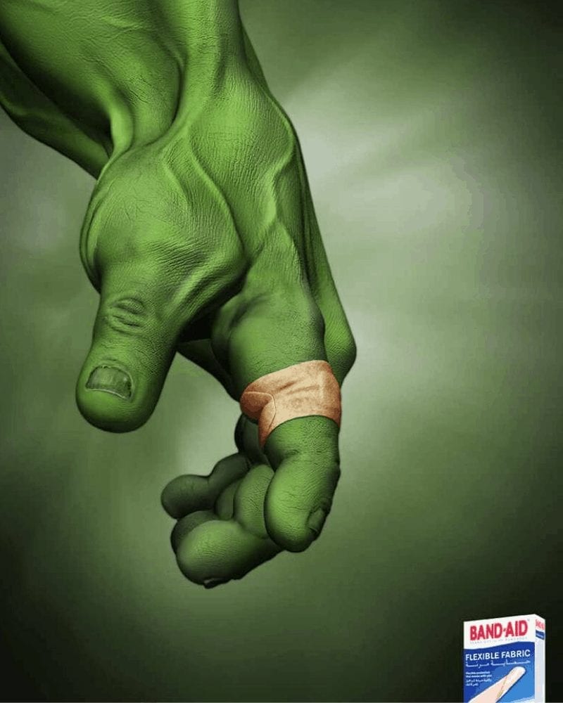
Therefore, since the band-aid is on Hulk’s finger, we assume that Bruce got an injury before he transformed. This points towards the idea that the new band-aids are flexible enough to fit a human and a giant creature like Hulk.
Keloptic: See More For Less
Optic retail companies get an almost universal pass for exaggerating the positive effects of their glasses. After all, how does one realistically show how well glasses work without a bit of exaggeration to make the effects visible to everyone? The following ad for Keloptic is really pushing the limits, though.

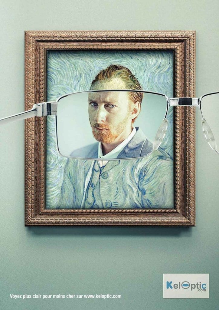
According to the ad, we should be able to put on a pair of Keloptic’s glasses and see fabulous results. So fabulous, in fact, that the famous painting of Vincent van Gogh becomes lifelike. The text at the bottom of the ad is in French, but it reads “See more for less”.
Mini Cooper: Fits Into Any Environment
This ad is more than just a showcase for how cute ladybugs are. As it turns out, it’s actually an ad for the Mini Cooper. The Cooper, according to the ad, is so small and convenient that it fits right into any environment. Here, the Cooper fits into the land of ladybugs, appearing small enough to drive on a blade of grass.

While real Mini Coopers aren’t quite that small, the overall message of the ad was conveyed indefinitely. This ad, in our humble opinion, is a 5-star example of how exaggerations can be both effective and not so over the top that we shake our heads in wonder.
Timotei Hair Products: A Lion Mane
Timotei is a popular hair product company. Recently, the company launched a successful ad campaign for its products, with the intention of drawing in new customers. This ad definitely drew us in — it has an extremely stylish lion so why wouldn’t it, right?
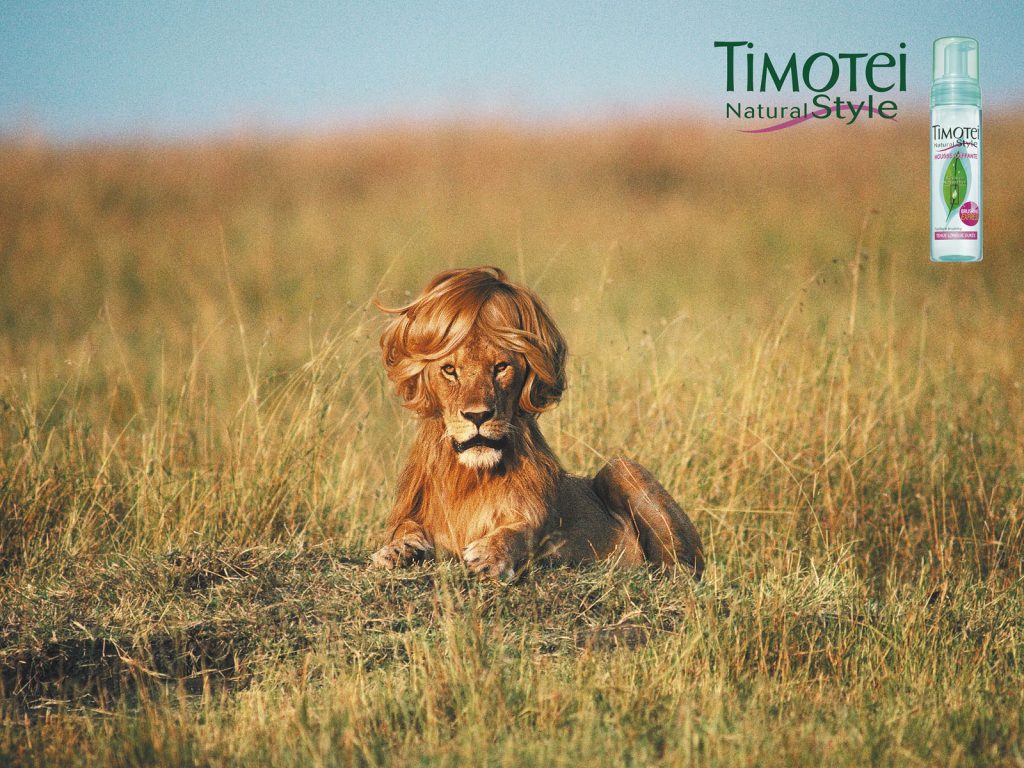
As far as we can tell, the meaning of the ad is to demonstrate just how well the product works to tame flyaways, frizz, and unruly hair. If it can tame the hair of an animal as fierce as a lion, it can surely handle your early-morning bedhead! We’re tempted to try it ourselves.
Nivea: Night Cream
The simplicity of some ads are the definition of “pure genius.” You’d think that to catch someone’s attention, ads would have to be full of bright colors and awesome effects — but this one is basic and simple, and has still caught our attention.
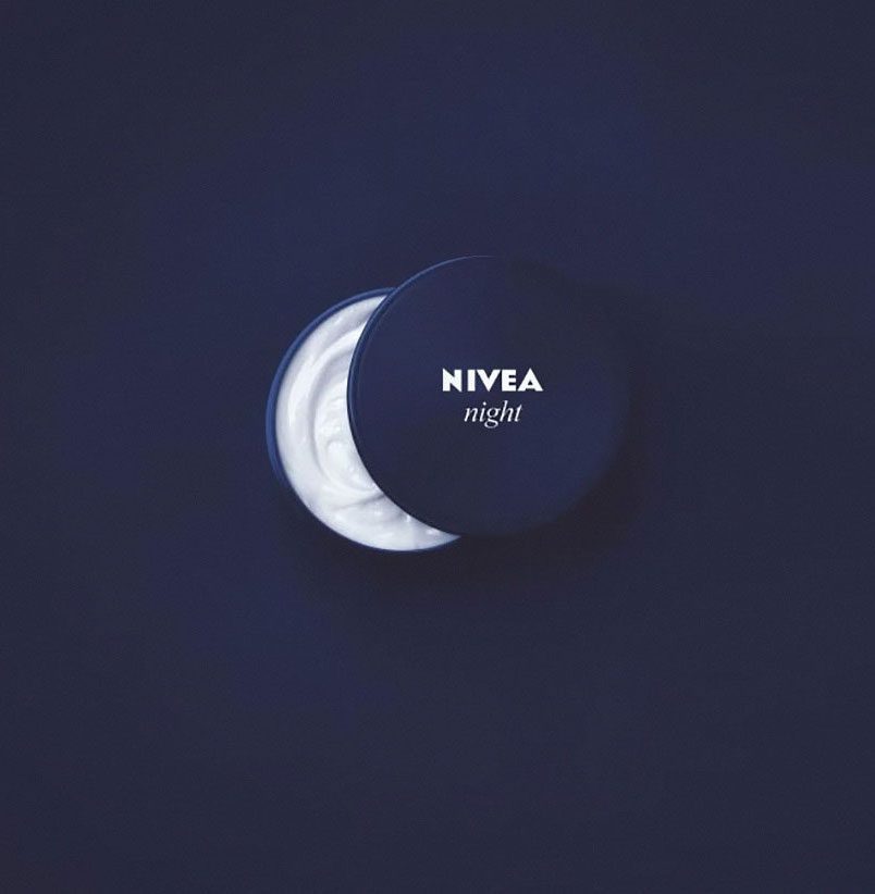
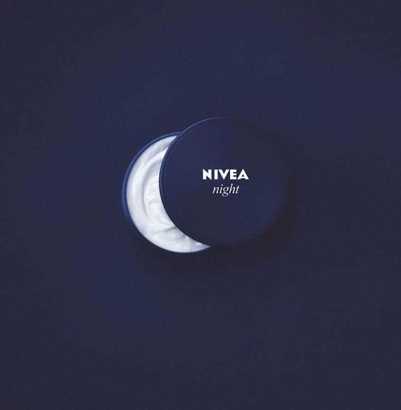
Nivea, the brand behind this ad, developed a night cream with healing properties that is said to rejuvenate the skin during the night time. The product is advertised via the crescent moon-shape that is made by the careful positioning of the lid. This ad is definitely smooth — like the cream being advertised!
New York Film Academy: Something Good For Cinemas
Can ads get any more creative than this? Hosted by the New York Film Academy, this fun ad proved to be both effective and innovative. The focus of the ad is a large theater-style popcorn bowl filled to the brim with buttery popcorn — or is it?
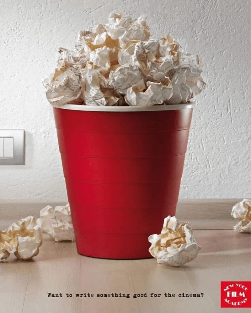
Nope! The bowl is definitely filled to the brim, but with balled up script drafts instead of popcorn. We had to take a closer look to believe what we were being told, but they really are balled up pieces of paper. It’s crazy how much they resemble real popcorn.
Focus Optika: Focus On Feeling
Most ads from optics companies are geared towards how they can improve the eyesight of their customers. Focus Optika, however, has chosen to advertise a different factor of the glasses buying process: how the glasses feel when they’re on the wearer.
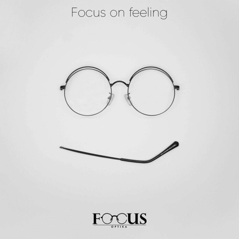
Using a simple pair of eyeglasses, the company set up their ad to remind customers to focus on how their new glasses feel, rather than just how they look or how much they cost. In addition to the saying “Focus on feeling”, the ad has also used the arm of the glasses in a clever way, using one to create a checkmark sort of shape.
FPA Australia: Stub It Out
Presented by the Fire Protection Association of Australia, this brilliant ad brings to light the troubling issue of wildfires that are started by cigarettes. It serves as a public awareness message that is designed to remind citizens to “butt out” before they leave their cigarettes lying around outside.
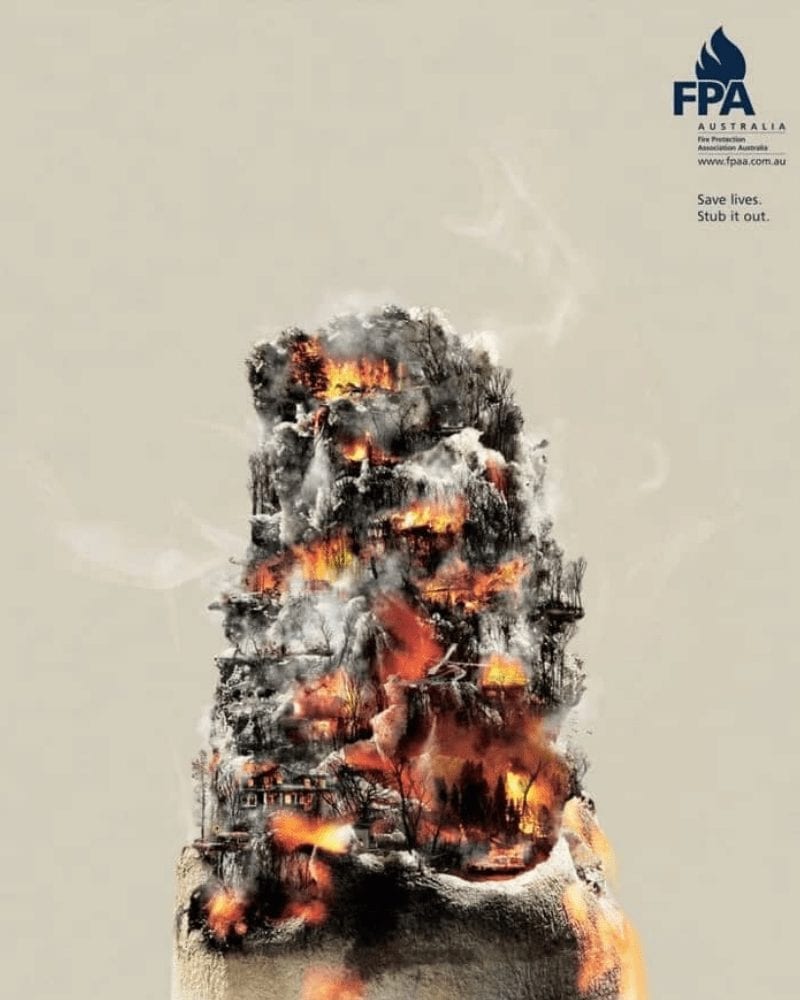
The butt of a discarded cigarette is made to look like a mountain with a burning forest on it, complete with smoke and fire, as well as a sense of dread. This ad is especially potent due to the wildfires that devastated the country a few years ago.
Harley Davidson: Build Yours
If you know anything about Harley Davidson, you know that the company takes pride in delivering quality products that can stand the test of time. Their bikes are, of course, their best selling products. But even so, the company frequently uses creative ads to keep customers’ interest.
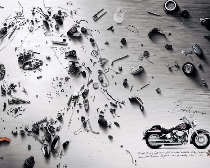
This ad, known as the “Build Yours” ad, uses various motorbike parts to recreate the portraits of people. These portraits are surprisingly detailed and realistic, and must have taken the artist ages to create. We definitely give props to whoever did this.
Bahia Government: Be Driving
Serving as another great public awareness reminder, this ad by the Bahia Government was put in place to try and reduce the number of distracted driving-related accidents and incidents. On it, the ad has a stop sign with a social media logo.

The logo is for Facebook, which serves to catch the attention of passersby. To give the ad a bit of context, it also has the words “When you’re driving, be driving.” In our opinion, this saying is basically telling drivers to “stop browsing Facebook and focus on the road.”
Tide: Removes Stains In A Single Go
As one of the most well-known detergent brands in America, it makes sense that Tide’s ads are some of the best. Normally, detergent ads feature laundry being washed, folded, and compared to show the before and after of using a specific detergent. But Tide’s “Removes Stains In One Go” ad has done things a bit differently.
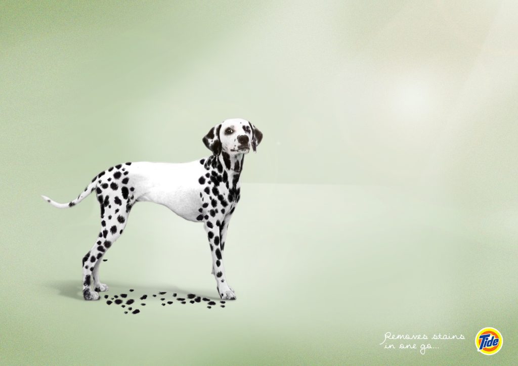
This ad uses a dog instead of laundry — which, in our opinion, is much more interesting! The dog is a proud Dalmatian with a body full of spots. The dog has been washed with Tide and his spots have started to come off after just one wash.
Bayer Aspirin: Aspirina
When it comes to minimalist ads, this Bayer Aspirin ad is one of our top picks and is deserving of being on our list. It draws an interesting comparison between football helmets and aspirin capsules while demonstrating an easy way to protect your head.
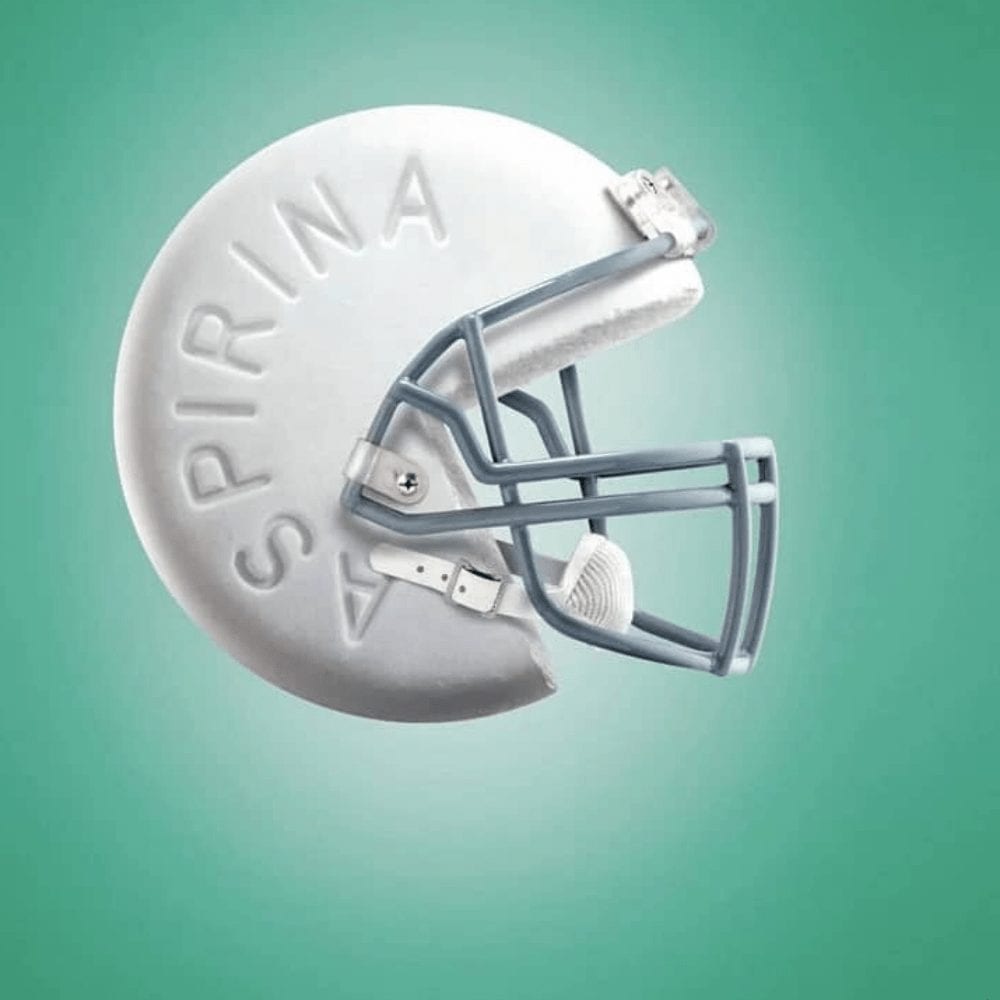
The helmet pictures protect your head from the physical dangers associated with football, while the aspirin capsule that is hidden within it protects your head from headaches. The idea and execution of this ad are great; the ad is easy to understand and gets its message across.
Bench Fix Styling Products: Superior Hold
Do you see that spider? Yuck! Wait — that’s not a spider; it’s his hair! That was our first thought upon seeing this ad, which is why it made its way onto our list. There’s something eye-catching about it and we think it’s most likely the “hair spider” on this man’s head.
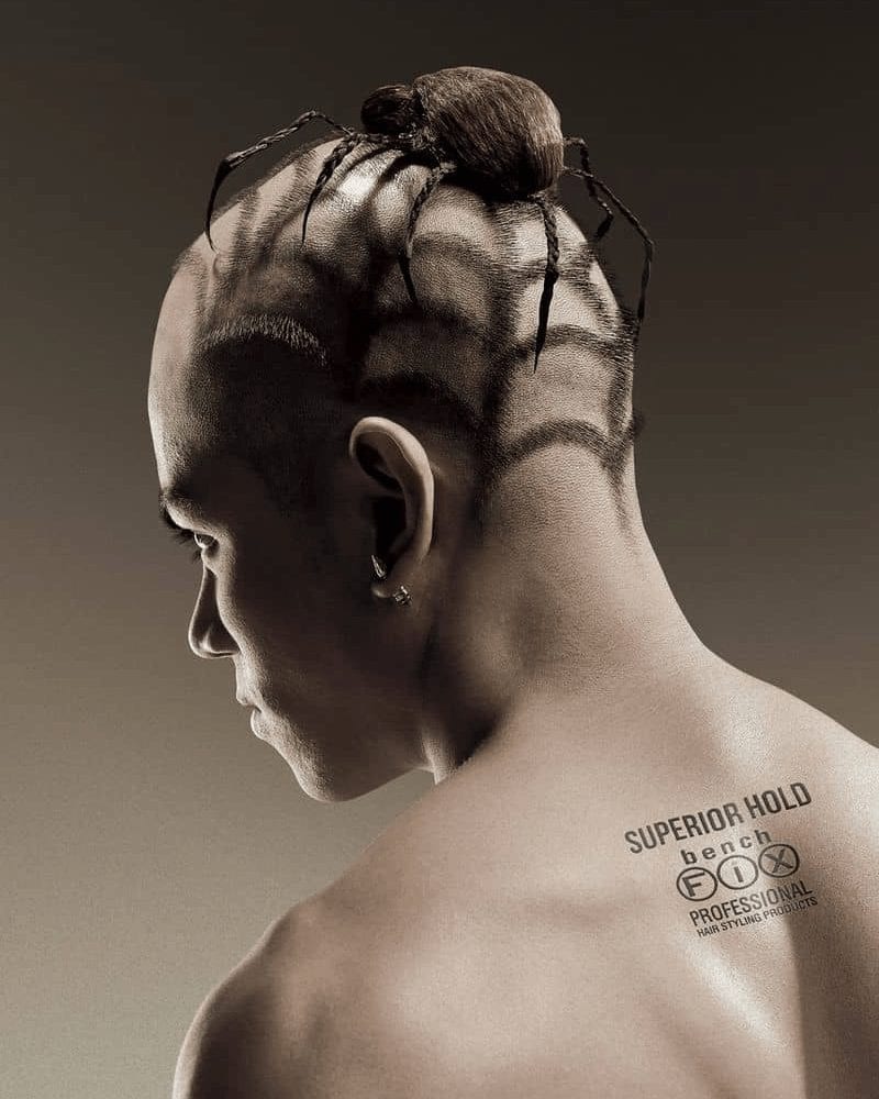
Advertising the superior hold of this line of products, this Bench Fix ad is dramatic and extreme, but effective nonetheless. When looking at this ad, it’s impossible not to imagine all the fun designs that you could make with products that have a hold this good.
Tele2: Empowering Small Businesses
Tele2, a communications business that you may or may not have heard of, was the creator behind this ad. Reading “We empower small businesses”, it was made to entice small businesses to work with the company, which offers a variety of services and affordable prices.
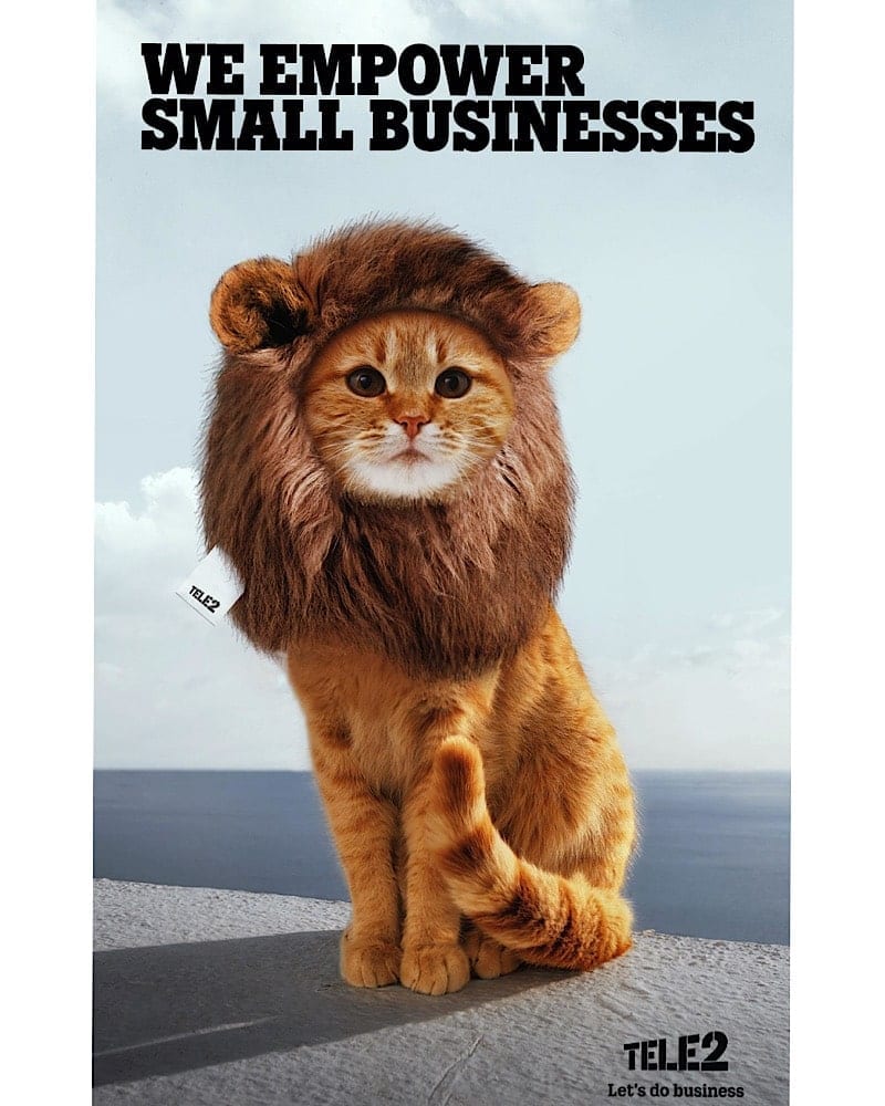
The services offered to help businesses grow, a fact that is demonstrated by the adorable photo of a cat with a fluffy lion’s mane. But why this particular photo, you ask? Simply put, the photo symbolizes the potential that small businesses have to get bigger when they work with Tele2.
The Economist: Light Bulb
This ad might just be the best one on our list. It doesn’t look like much in the first photo; just a light bulb against a red background. However, give it a bit of time and wait for someone to pass under it, and you’ll get a chance to watch the magic happen.
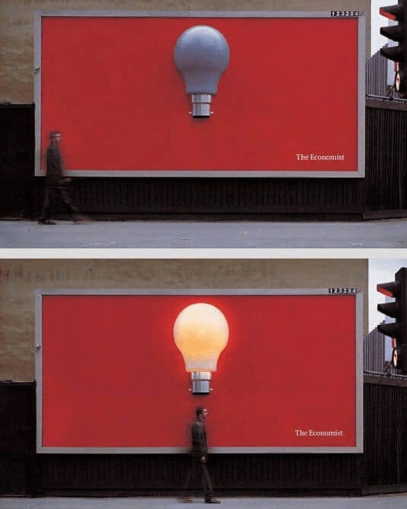
When an individual walks underneath it, the lightbulb lights up. Posted by The Economist, this ad does a good job of promoting the publication. Its interactive feature is a breath of fresh air, standing out from the rest of the fantastic ads we have on our list.
Pampaverde: Extra Big
This humorous ad is courtesy of Pampaverde, who aims to promote their Extra Big burger. The brilliance of the effects used in this ad is what scored it a spot here, but its mouthwatering photo of the Extra Big burger was also a factor.
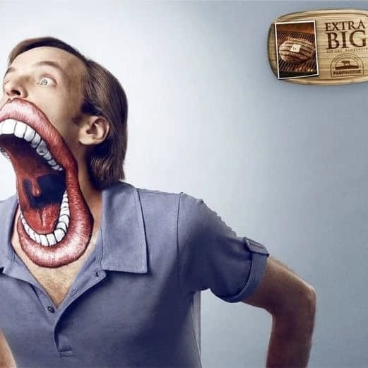
The image is that of a man with a very large mouth, leaning off-screen to take a bit of the Extra Big burger. Of course, his mouth isn’t really that big (but boy would it be impressive if it was!) — it’s just painted with awesome effects and a ton of skill.